

While the news cycle typically talks about individual development projects individually, looking at the bigger picture can reveal larger trends or insights. For instance, since we published our map roundup last week of the 16 biggest multi-family projects taking shape around Louisville, readers have been blown away with just how much development activity is happening around the core city. (Plus, don’t miss my discussion of the apartment boom with WFPL’s Jacob Ryan.)
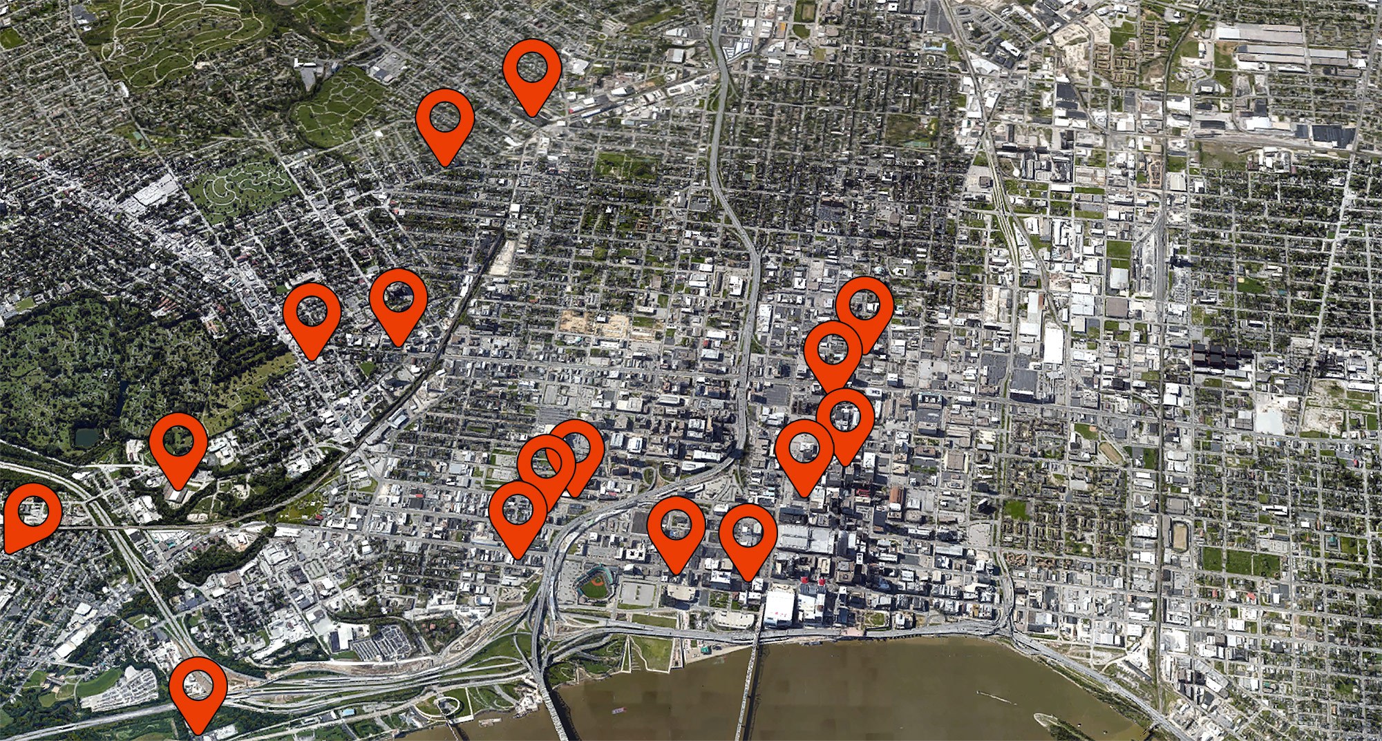
What else have we learned? What’s clear about the locations developers are choosing to build apartments is, above all other things, walkability. (There are a lot of other things to be learned as well, including how Old Louisville and anywhere west of Fourth Street is noticeably lacking in multi-family development, but that’ll have to wait for another day.)
While a bunch of projects are clustered in Downtown (itself a fairly walkable place), there’s a clearly visible ring of multi-family projects in Louisville’s inner ring suburbs, from Germantown to Clifton to the Original Highlands to Phoenix Hill. It’s clear that developers are banking on our interest in an urban lifestyle, harnessing the power of density to create places that support local businesses and don’t require getting behind the wheel for every little errand.
Those 16 projects will fundamentally reshape the city’s built environment, adding more people to areas that have had a stagnant population for decades. They will be able to support more businesses and more transit and, potentially, could fuel another round of multi-family development that follows the growth of core neighborhoods.
But where are Louisville’s residents—specifically renters who might be interested in these new developments—living today? Here are three more ways to look at it.
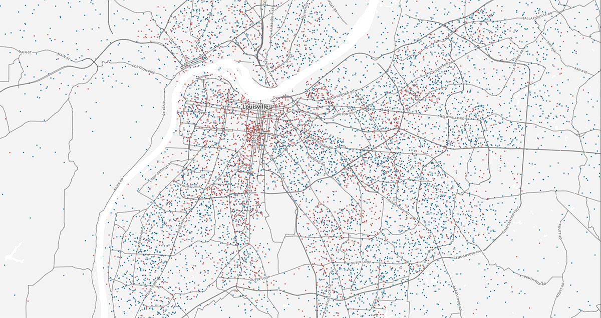
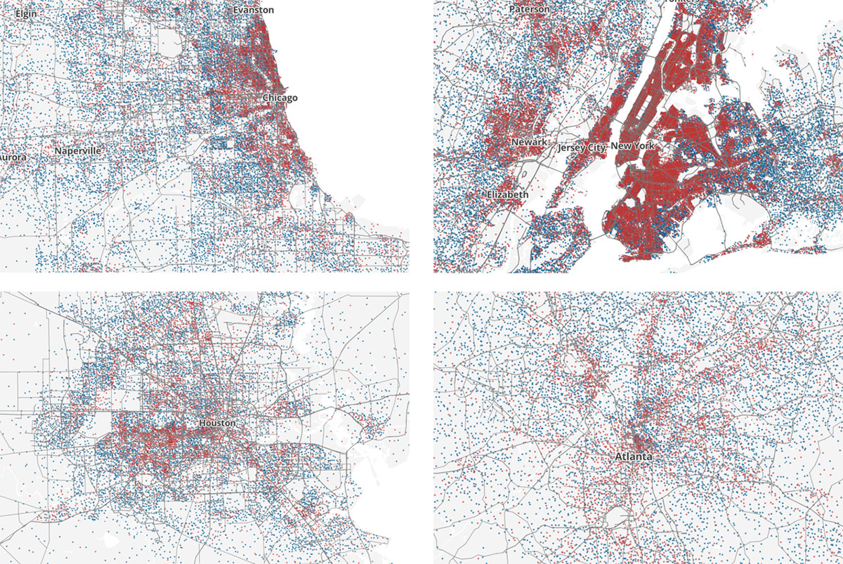
First, journalist and web developer Ken Schwencke has created a map showing every single person renting an apartment in the United States (or groups of 25 of them) with a red dot. If you zoom in to Louisville, you can see that there’s a fairly even scattering of renters across the county with a couple hotspots, most notably Old Louisville.
CityLab’s Laura Bliss reported on the mapping project last summer, focusing on the nation’s affordable housing crisis. Back in July, the Census Bureau reported that the national “homeownership rate has declined to 63.4 percent, the lowest it has been since 1967,” Bliss wrote.
Shwencke’s map, “Where the Renters Are,” uses 2013 American Community Survey data and each red dot represents 25 people renting across the country, randomly placed within their respective census tracts. The blue dots, by comparison, show owner-occupied units.
Bliss pointed out that in places like Louisville—and the South in general, where homeownership rates have remained among the highest in the nation—the homeownership rate is also in decline. “A drop in homeownership isn’t inherently bad,” Bliss wrote. “Homeownership rates can decline alongside economically positive developments—like young people moving out of their parents’ homes and into their own apartments.”
Bliss sounds a warning about rising apartment costs, which Louisville is seeing with its new stock currently under construction: “About half of all renters pay more than 30 percent of their incomes toward housing,” she wrote. “Add a debt crisis on top of that, and you have a nation of people who not only lack the savings to imagine buying a home, but who can’t even reasonably afford their current apartment.”
Another dynamic happening in Louisville is that this wave of apartment buildings is really the city’s first apartment boom, where other cities have already had a lot of such development. Developers are often quick to find the largest return on their investment and seek the highest rents a market can bear. With Louisville relatively underdeveloped in urban apartments, there’s plenty of room at the top for expensive units. Moving forward as these units come online, it will be crucial to watch how the market responds.
It will also be interesting to watch future Census data to see if there’s a clustering of renters once more apartment buildings come online. Right now, Louisville looks more like Atlanta or Houston in the maps above, compared to larger metropolises like Chicago or New York.
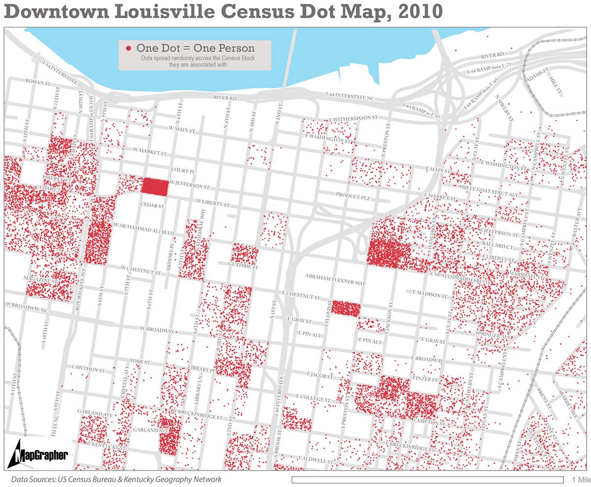
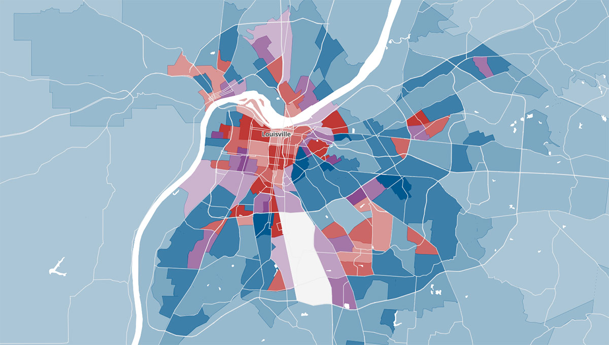
Next, it’s worth revisiting a map we published here last January showing every person living in and around Downtown Louisville. The map was created using Census Data from 2010 by Louisville’s Pat Smith.
“I think Downtown Louisville badly needs a hearty injection of new residents in the Downtown core (and much needed new multi-unit housing development to make that possible),” Smith wrote in the article. “There are huge gaps in residential buildings across Downtown, and most of the only truly dense Census Blocks from 2010 are public housing towers and corrections centers.”
As Smith pointed out, the map shows all people residing in the core city, not just people renting apartments. Louisville does have a good number of privately owned condos and some of the densest blocks above are either jails or hospitals.
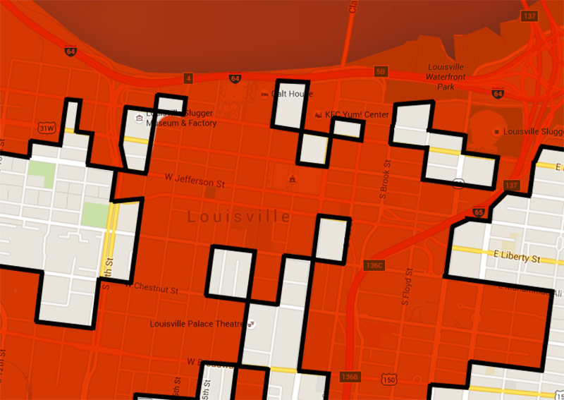
The map still shows vast areas of Downtown where no one lives, which brings us to our next map.
Last week, Streets.MN’s Adam Miller wrote about his so-called “Downtown Home-Free Zone” showing blocks in Minneapolis where there are no residences. In the map, Miller visualized what what he calls “the main problem” with retail in Downtown Minneapolis: “there are large swaths of downtown in which no one lives.”
Miller writes that there’s reason to be optimistic with many new projects in the works in Minneapolis—just as in Louisville—but adds that “there will always a be challenge inherent in the fact that we built out the heart of downtown in an era that didn’t require (or maybe even discouraged) mixed use development.”
We decided to create a similar version for Louisville, above. This rough map was eyeballed from online maps and includes only actual residences (so no jails or hospitals here). While we initially thought the Louisville map would be similar to the Minneapolis version, depicting a hole in the center of town, it appears as though Louisville’s is a bit worse. In Louisville, the “home-free zone” bleeds off the edges of the map in several places and forms a much larger area outside of the city core.
Now obviously some of the blocks included in the zone are the river, highways, or interchanges, but it still demonstrates the lack of housing in the Central Business District. Many of the blocks where housing does exist, either rental or privately owned, there only a small single building with homes, which inflates the appearance that there are sizeable oases of housing in the map above.
What conclusions do you draw from these mapping exercises? Share your observations in the comments below.
[Top image by flickrized / Flickr; montage by Broken Sidewalk.]


The exercise above leaves a significant number of Metro’s newer, and larger, multi-family complexes. In particular, I’m thinking of some very, very large projects presently either complete or well underway in J’Town and along the Shelbyville Road corridor. These new, very dense projects are shifting population densities within Metro. They are also putting real housing density adjacent to existing job centers that previously did not offer much in the way of this scale/type of housing.