

![]() On Saturday, June 11, the Central Kentucky Chapter of the American Institute of Architects (AIA-CKC) will host its annual Home Tour and this year, we’re excited to be presenting media sponsors. The AIA-CKC Home Tour includes eight houses across Louisville, from Crescent Hill to Old Louisville to Norton Commons—you can view a full list here.
On Saturday, June 11, the Central Kentucky Chapter of the American Institute of Architects (AIA-CKC) will host its annual Home Tour and this year, we’re excited to be presenting media sponsors. The AIA-CKC Home Tour includes eight houses across Louisville, from Crescent Hill to Old Louisville to Norton Commons—you can view a full list here.
Home Tour tickets for all eight houses and an After Party Downtown at the Marketplace on Fourth cost $15 in advance via Eventbrite and $20 at the door of any house on the tour (cash only). Proceeds will benefit Habitat for Humanity. You can also share the Home Tour with your friends on Facebook. At the After Party Broken Sidewalk will be moderating a panel discussion on residential architecture in Louisville.
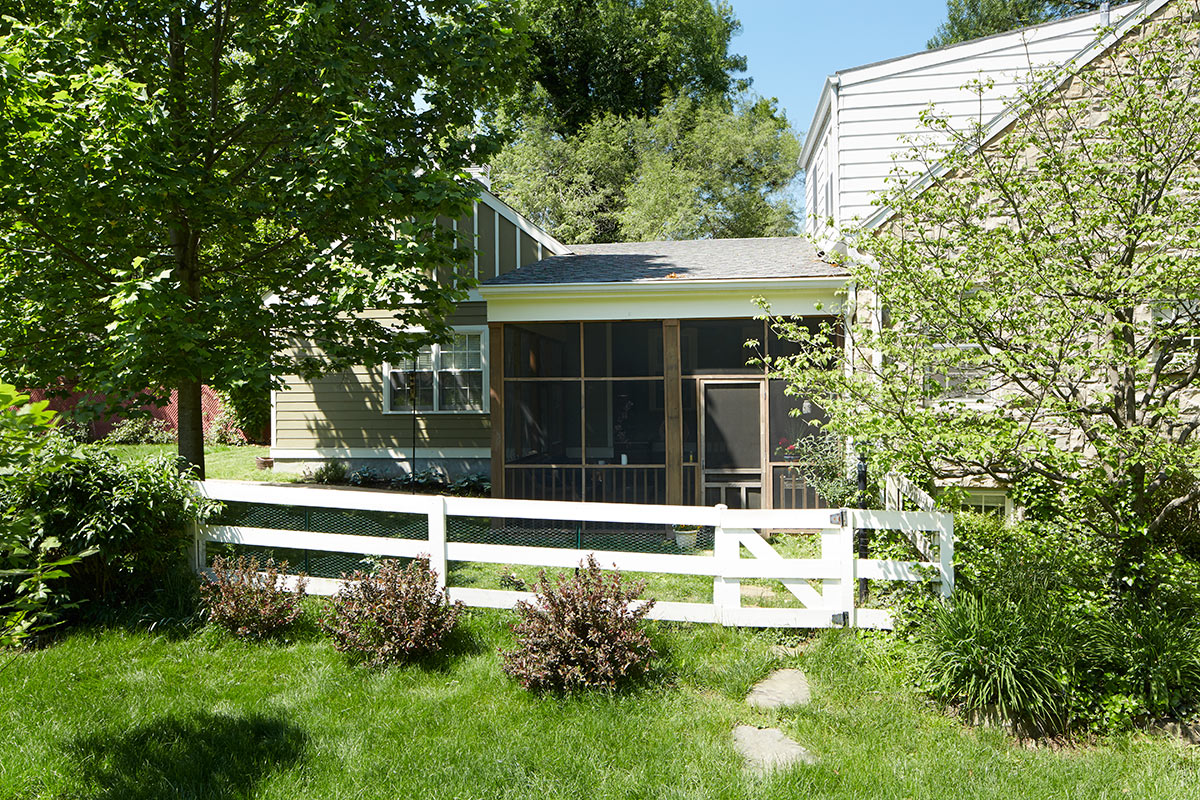
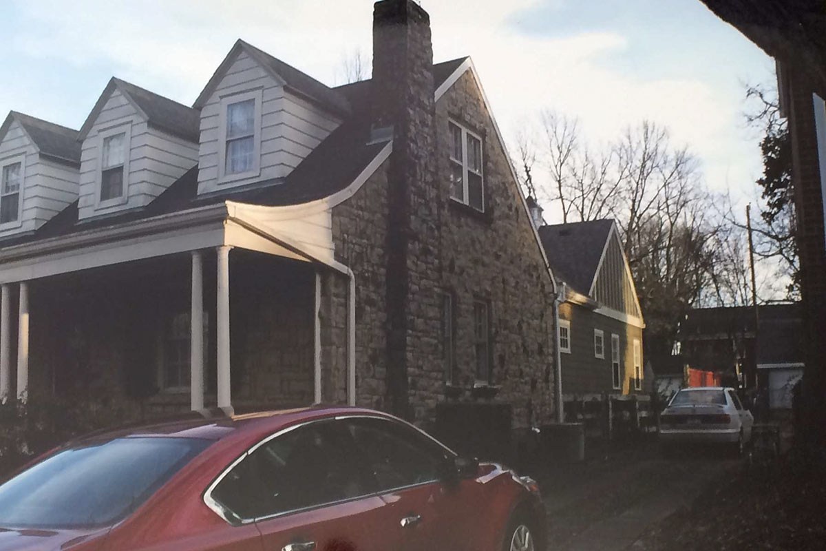
Leading up to the Home Tour, we’ll be highlighting each of the architects and their houses in exclusive interviews. Architect Mary Herd Jackson has completed the renovation of a circa 1932 Cape Cod–style house formerly belonging to another architect, Ed Krebs. The result is the Fritschner Residence, 1932 Lowell Avenue (map) in Strathmoor Manor.
The transformation, a collaboration with Krebs for the new owners, helped create a home tailored to the lifestyles of the clients and their family dog, Jack. Lyn Mabry of Living Spaces by Lyn served as the interior designer.
Broken Sidewalk: Why should I come tour the Fritschner Residence?
Mary Herd Jackson: Baby boomers are aging, emptying the nest, and planning for the future. Choosing a great neighborhood is a priority. These owners scored a charming (and nearly irreplicable) stone cape cod on a large corner lot. They just needed to adapt the house for their use to accommodate frequent family guests upstairs and to create comfortable first-floor living for themselves. Their goals—keep what is beautiful and add what is lacking—apply to many home renovation projects.
What were the owner’s priorities for the project?
When the owners purchased 1932 Lowell Avenue from architect Ed Krebs, they discussed the feasibility of a first floor master suite and outdoor room. Ed provided programming and schematic design services.
In the programming phase, he discovered which spouse watches TV, the size of their previous closet and bathroom, and the central role of Jack, the family dog. These details were meshed with the desire for a quiet retreat for reading, dressing, and relaxing.
The goals of the outdoor room, in this case a screened porch, included connecting both the master suite and the current rear door to the garden while providing some privacy from the side street. Ed translated the owners wish list to a schematic design which is essentially what was built. During design development, I rotated the roof ridge and box bay 90 degrees. During construction, Great Houses suggested a modification of the porch roof.

What concepts or specific elements inspired the design? Which design elements are true to the house’s past? Which design elements are breaks from the past?
In designing an addition to a significant building, the architect often wants to repeat (forms, shapes, details, “vocabulary”), relate (size, scale, surroundings), and complement (material, texture, function.) For an historic building (circa 1932), the goal is to support, not dominate, the existing building.
In this case, we repeated two roof forms, the 9:12 gable and the shed roof (existing dormer and new screen porch.) Double hung windows in the original 6/6 pattern face the garden while smaller six-lite awning windows face the neighbor. The ceiling height, nine feet, was matched in the addition except for the bedroom where we used attic space to bump the height to ten feet. Two new, uncased arches duplicate those in the original house. A box bay window creates a cozy alcove as recommended in Sarah Susanka’s The Not So Big House.
I like to joke that “roofs and closets keep me in business” but the truth is attractive roof lines for additions can be challenging. Sometimes a “simple room addition” is not so simple to figure out but the result can be elegant and an asset to the whole.
It is no shame for an addition to read as an addition. That is, in fact, the goal for most historic properties. In this project, lower roof height, smaller massing, and a less impressive material (board and batten compared to stone) combine to make the addition complement the original rather than to compete with it.
What was the strategy for outdoor space?
The outdoor space was designed and installed by the owners, past and present. The wood fence provides a border between public and private spaces. Lakeside Drive, the side street, is heavily used by pedestrians. A combination of shrubbery and trees provides privacy and shade.
The outdoor room was designed by the architects as intentionally as any enclosed space. Function, connectivity, and sunlight are some of the factors considered. The sloped ceiling increases the sense of space and air movement. Its stained bead board compliments the natural stone of the original house.

What was a splurge in this project? Where did you find savings?
Designed with the owners’ budget in mind, the modest scope provided the main savings. We did not build for future owners (whirlpool tub, first floor laundry, oversized closets) but for these owners. (In my experience, someone else usually likes the clients’ choices when it comes time to sell.)
In order to decide about several specific details, we got individual costs on a skylight, second window in the current den, solar light tunnel, steam shower, and heated tile floor for the master bath. Of these options, only the heated floor was selected. This is a splurge they enjoy for several months each year. They also upgraded the bedroom flooring from carpet to hardwood (more pet friendly).
Though part of the base bid, a wet bar on the screen porch, may be considered a splurge. With hot and cold water and a mini fridge, it accommodates beverages and flower arranging.
Good construction techniques are not a splurge. We specified excellent insulation, windows, and cement fiber siding. All of these contribute to longer life, lower maintenance, and less energy use.
What is one of the owner’s contributions to the design?
There are several thing the owners visualized: the cupola, the cane-front cabinet doors, and a rough finished concrete texture for the porch floor. These suggestions were very successfully implemented.
The exterior siding color was chosen in an unusual way. It was installed in its primed condition and the neighbors were so complimentary of the color that the owners decided to make the finish coat the same color. The contrasting batten color was their decision as well.
[Top image by Ted Wathen / Quadrant Photography.]


I wish architect Ms. Herd-Jackson would invest some creativity and TLC into that cash cow @ 112 W. Ormsby Ave.
Perhaps she should be her own client!