[Editor’s Note: Louisville has made some pretty amazing achievements in its first 238 years—but it’s made a few blunders along the way, too. This week, we’re launching a new contributed mini-series documenting eight of the best and eight of the worst decisions, ideas, or projects that have profoundly affected the city. This list is by no means complete—and you may have strong opinions of your own about what should be on the best or worst lists. Share your thoughts in the comments section below. Or check out the complete Best/Worst list here.]
A world-class architectural landmark, the Humana Building, sets a high aesthetic standard for Downtown Louisville.
Wendell Cherry and David Jones announced on May 28th, 1982, at Actor’s Theater, that New Jersey–based architect Michael Graves (1934–2015) had won a competition for their company’s headquarters—and was widely applauded.
Graves beat other high-profile firms including Helmut Jahn of Chicago, Ulrich Franzen of New York, Cesar Pelli of New Haven, Conn., and Norman Foster of London.
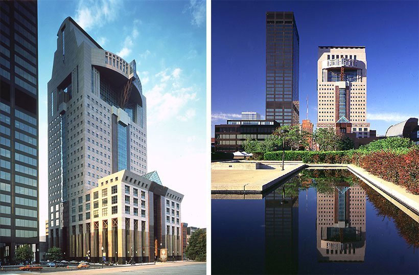
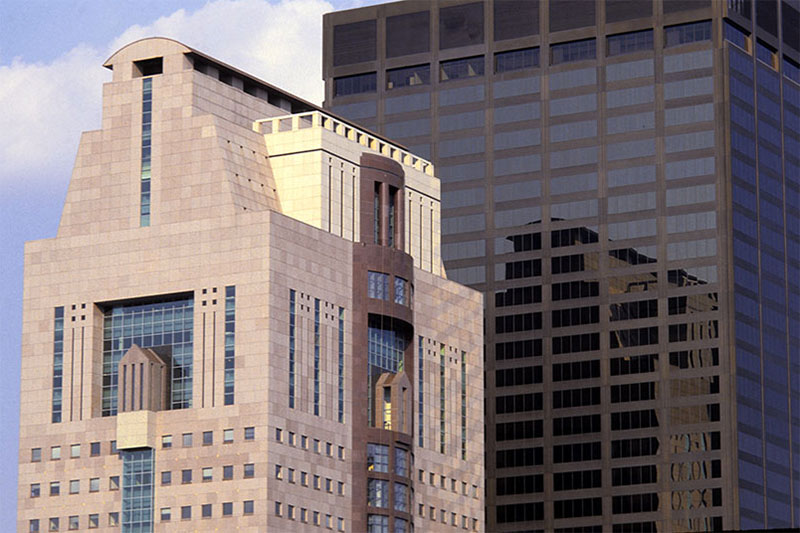
The resulting 26-story, 525,000-square-foot structure was notably clad in pink granite. It exceeded all expectations, despite some initial criticism.
“Louisville is a pleasant, friendly, slow-moving town of 298,000 that is certainly not known for being at the cutting edge of architectural design,” began a harsh review from the Chicago Tribune‘s critic Paul Gapp in 1985. “[A]lthough Graves has turned in a strong performance here, the Humana building still suffers serious visual flaws.” Or so the culture of the mid-’80s architectural world thought.
Still, Gapp was an astute observer of Louisville’s urban situation, noting, “The biggest construction mistake made in postwar Louisville is an expressway that runs along the edge of the river and cuts off the downtown area from its greatest scenic and recreational asset.”
Gapp called the project “radical Postmodernism” for the structure’s non-boxy facade and detail that related to its surroundings along West Main Street. It was this boxy architecture that Graves eschewed.
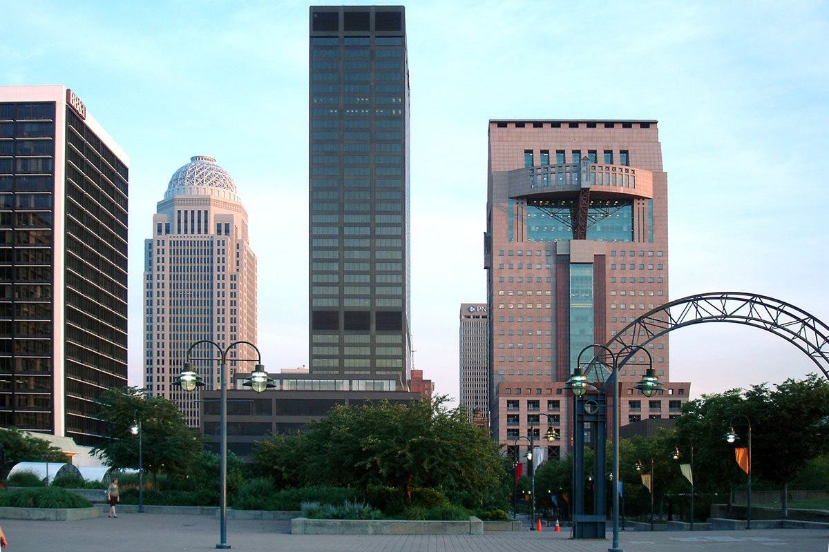
In fact, Graves said in a lecture at the Humana Building on its 25th anniversary that he often quipped how the neighboring National City Bank tower by New York’s Harrison & Abramovitz was the box that the Humana Building was delivered in.
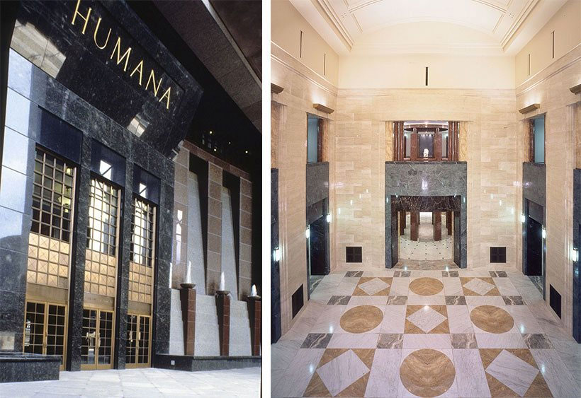
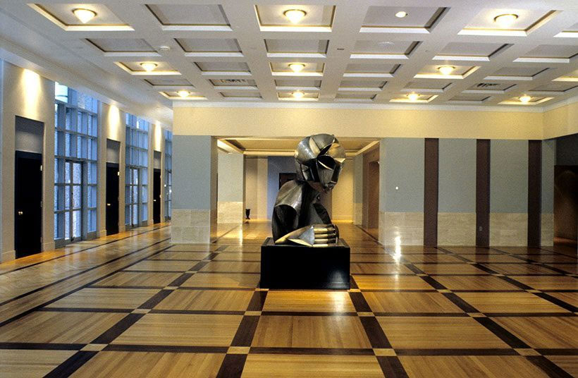
But it was this attention to composition and massing that made the Humana Building such a win for Louisville. The tower related in scale well to nearby cast-iron warehouses along West Main Street, to its interior marble rotunda, and the design is well-thought through-out the entire structure.
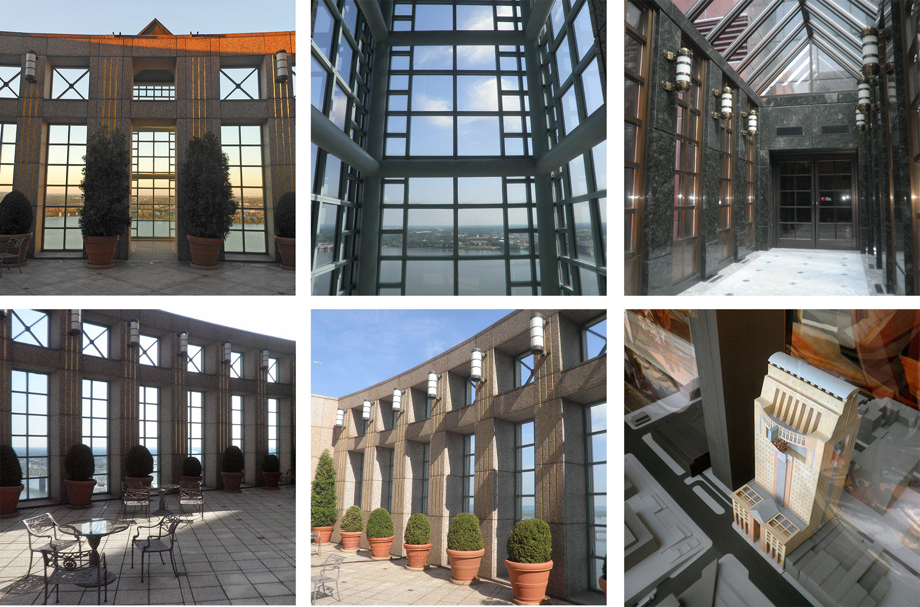
The 25th floor offers a phenomenal layout containing an exquisitely detailed auditorium and a magnificent exterior overlook of the Ohio River. On the south side is a curved staff lounge area for each of the upper floors.
The entry loggia has cascading water fountains set within a massive granite colonnade recalling the Falls of the Ohio. High above, a prominent steel truss on the north facade echoes the structural framework of nearby bridges.

At that 25th anniversary lecture, Graves was clearly proud of his buildings—one of the most important structures of the 20th century. He said he would only change one thing: that the stone behind the entry waterfalls be a darker color to better show off the cascading water.
The Humana Building is a sensory overload of color, shapes, materials, and experiences. And Louisville is fortunate to have it.
Michael Graves created numerous iconic projects across the country and the world—at both large and very small scales. Some of his best known buildings include the Portland Building in Portland, Ore., the Disney Headquarters, the Denver Public Library, the San Juan Capistrano Library, and the Swan & Dolphin Resorts in Orlando.
At the other end of the spectrum, Graves designed countless household goods including an iconic toaster and tea kettle for the likes of Alessi, Target, J.C. Penney among others. He also has designed housing for disabled veterans and medical equipment meant to make time spent in hospitals easier. Graves himself was paralyzed and bound to a wheelchair.
Time has shown that critics like Gapp, who claimed “Graves spoiled the totality of his design effort with the failed facade,” missed the bigger picture of the Humana Building. It’s one part of what makes the Louisville skyline so distinct without ignoring the fact that it touches the street as well.
[Top image by Jeffrey Hood / Flickr.]








One of postmodernism’s high points. If only we had an Aldo Rossi building to go with it.
In 1990, Time Magazine, named the Humana Building best building of the decade, in a review
of the best of design from the 80’s. Also, several
years ago the national AIA took a vote on the top
100 architectural icons in the US and the Humana
Building made the list.