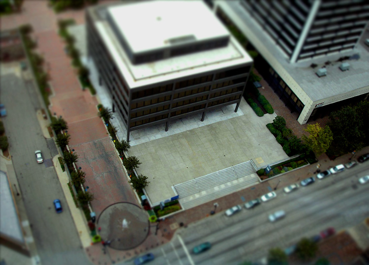
“It is difficult to design a space that will not attract people. What is remarkable is how often this has been accomplished.“—William H. Whyte
Ever wonder why the plaza in front of the American Life building is always desolate while the plaza at the National City Tower (Fifth and Market) often teems with life? William H. Whyte knows. Whyte was a journalist, sociologist, and people-watcher whose study of the way we interact in urban spaces left an important mark on how we view the city. (I mentioned him earlier when he appeared on a list of noted urban thinkers.)
One of his most important works, The Social Life of Small Urban Spaces, helped to clarify our behaviors in the city, from the simple children’s play lot to the modernist skyscraper plaza. He observes how people congregate, where they sit, and what factors attract and repel people from particular spaces. His findings, I have found, also prove true in my own observation of the city.
One subtle behavior you can test out for yourself is how people mimic posture and stance in conversation. Talk to someone near a set of steps and casually place your foot on another step. Whyte observed that, in most cases, the other person will reciprocate and also place his or her foot on the adjacent step as well. You are in essence forcing the person you’re talking to to chance stance unknowingly.
Another of my favorite observations involves movable public furniture, such as a folding chair (as opposed to a bench). Whyte notices that when someone moves to sit down in the chair, he or she will move it. This shift could be an ever so slight turn in direction or a change of several feet. By moving the chair, one creates a personalized space and a feeling of ownership in his or her surroundings. Bryant Park in New York with its famous folding chairs is a classic place to watch this behavior unfold over and over again.
Watching these behaviors naturally play out and understanding why we interact in such subtle ways is quite fascinating. It’s one thing to simply move through the city as we all do, but to suddenly see before your eyes the invisible behaviors that are playing out is a powerful way to view public space.
Whyte created a film as well as a book detailing these observation, beginning with the plaza in front of Mies van der Rohe’s Seagram’s Building in Manhattan. (Check out the the video broken into segments on YouTube. h/t Tropolism) I had the opportunity to have lunch in this plaza several times this summer and was able to recount some of his initial observations from decades ago. People behave the same today as then. You could, of course, watch any urban space in any city and come away with similar observations.
Back in Louisville, we have quite a few small urban spaces mixed throughout Downtown and elsewhere, some better designed than others. Many are hanging on by just a thread, showing just how much poor design people will put up with. Seagrams’ plaza and the American Life plaza were designed by the same architect, Mies van der Rohe, but their quality as urban spaces is drastically different.
What are your observations of small urban spaces whether it’s a pocket park, an urban plaza, or simply the sidewalk? What are your favorite and least favorite spots and what contributes to their successes and failures? Perhaps one day we can determine what exactly it would take to transform all of these spaces into vibrant pedestrian places.


I love doing tilt shift photography. Do you have an actual tilt shift lens, or did you do this with photoshop?
i don’t think the distinction in your first sentence is 100% true. i know that american life used to have skaters that used the space. if they aren’t still, i’d guess it has more to do with them being run off than anything to do with the space. also, i’ve seen people sitting on the steps both at main and at the side facing east and having lunch.
there IS an empty feeling about the bulk of the flat space – even when it’s occupied, strangely enough. same with the lobby inside the curtain wall. the choice of materials and the way they were used adds to this feeling of quiet/empty, as is true at a lot of mies’ work. and the plaza level was most certainly about separating the building – raising it up off of the noise/activity of main street.
neither good nor bad, imo, just a different approach to the development of the space, more contemplative than national city plaza.
I can’t buy into the idea that the American Life plaza is merely “contemplative” and just a different but acceptable approach in its current state. While it’s true there may be an occasional sitter on the steps along the sidewalk (and from my experience working a block away for years, it was fairly seldom), the design of this plaza still could be improved. (I really do love the American Life building and the plaza as a piece of architecture, but as you say it does feel empty.)
Mies van der Rohe did have a profound ability to create contemplative spaces, both through the use of materials and the proportions of his architecture. I cited his Seagram’s plaza as an example of this at its finest. It’s effect is elevated by the urbanism surrounding it. The Louisville equivalent contains many of the same details and materials but is significantly less effective, overwhelmingly because there’s simply no place to sit. (There’s also no help from the series of open plazas surrounding it, either)
I can’t advocate just throwing in some benches and calling it a day, however. Because of the quality of the American Life building and the detailed austerity of its plaza, a good effort would be required to create something that would fit. The Seagram’s plaza uses low walls and monolithic blocks of stone set around fountains but perhaps delicate movable chairs could be an acceptable and unobtrusive solution. In the end, the design is significant (and shouldn’t be irrevocably altered), but it’s not living up to it’s potential as even a contemplative space yet.
(Interestingly, based on the Seagram’s design, the depressed area on the other side of the American Life building appears to have once been a fountain as the basin designs are the same.)
On Cory’s note about the photo, I wish I had an actual tilt-shift lens, but for now I am happy to create them in Photoshop from time to time.