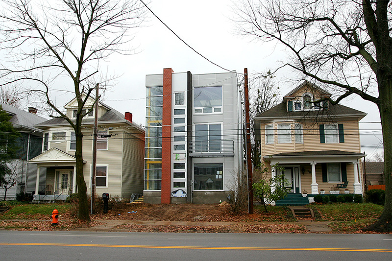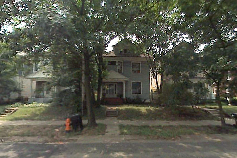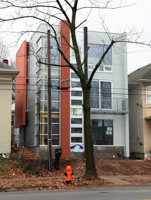
An unassuming wood frame rental property on Eastern Parkway near Bardstown Road has been transformed into a modern single family home. Bob German and his partner Brent Carter hired architect Michael Koch to help transform the property at 1824 Eastern Parkway into Louisville’s newest modern town house ready for occupancy in February.


German says original plans called for tearing the sided two-and-a-half story house down and starting from scratch, but zoning rules didn’t allow the size of house that was desired. Instead of seeking a costly zoning variance that wasn’t guaranteed to be approved, the house instead went through a breathtaking renovation.
When tipsters began mentioning a new modern building on Eastern Parkway, I began searching for information. When photos began to pour in and I learned the project was a renovation, I was really surprised. From the outward appearance, the building looks brand new.
Bob German currently lives in the Highlands and loves the area’s walkability and urban offerings. He often visits Chicago and wanted a modern dwelling right in the heart of the walkable Highlands and he says you can’t find a part of Louisville more walkable than Eastern Parkway and Bardstown Road.
The team began work planning the house a year and a half ago and German says despite the modern change to the property, neighbors and the city have been overwhelmingly supportive. Even though some neighbors might not want their own modern house, they understand what living in a city and in the Highlands is all about.
Michael Koch, who designed the Gallery Square Lofts on East Jefferson Street and Clay Street, was able to provide the benefits of an urban condo with the amenities of a house all while using the original structure’s foundation. German says choosing to renovate instead of build new did add significantly to the overall budget, and says it’s probably not the right choice for everyone. In this case, the zoning pressures made it feasible and German believes it will be worth it in the end.
Eastern Parkway is zoned R-5 meaning a structure cannot take up more than 50 percent of its lot size even if the original structure has a greater density. In this case, the original house takes up more half the .05 acre lot.
While the modern house appears to contrast its surroundings, there are important contextual clues that help it relate to the neighborhood. The structure conforms to the same setback as the houses surrounding it and generally maintains the same building height. The new house emphasizes the horizontal lines of its siding with a fenestrated corner. The projected front bay can also be considered a response to the asymmetric bay windows of neighboring homes.


It's a nice building. I've always respected Michael Koch's work and think he's one of the few architects in Louisville doing consistently good design.
That said – could they not find a vacant lot to do what they wanted? To take a nondescript, but decent house and essentially insert this non-contextual (yeah, it holds the set back from the street) pod in it's place is in my opinion a real waste of the existing building it replaced, and the opportunity to showcase modern architecture in a less 'in your face' light.
A real travesty. I'm suprised they didn't tick off all the green/sustainable qualities this new building must have while completely neglecting the fact of how much of the existing building ended up in a landfill.
i think this takes more cues from the typical highland house than setback, some of them pretty clever. like the pop-out window 'bay' at the side which so many of the earlier houses (like mine) have. the registration of 3rd floor line with adjacent gutter lines works pretty well.
where is doesn't take cues from the type is where it goes wrong, too.
1. moving the entry to the side seems like a strange decision and leaves the front feeling incomplete. the vertical run of windows looks like an attempt to address the fact that the front door is missing.
2. the lack of anything like a porch at the first level – not that porch was necessary, but something should be there to serve as transition between the sidewalk and house. the foundation is too tall and bare. the lack of any transition element makes the house feel aloof and removed from the sidewalk/street, unfriendly, despite the fact of holding the setback line. landscape development will probably screen the bard foundation, but will only serve to remove it from the sidewalk more.
overall i like the house, despite those critiques. mostly i appreciate that the clients committed to such a project. i'm sure it met with a lot of doubt and criticism. eastern parkway can accommodate a variety of building types and styles – no reason this can't become part of the collage.
while it certainly doesn't hide, it isn't disrespectful either.
Let's face it, any modern infill in Louisville is going to be out of place. An empty lot might have been preferred as the resulting structure is clearly inauthentic. The main issue I have with it is that the height is a bit out of scale to the other buildings. If you are going to do modernist on a street of older building, better to do something that looks more infillish. I'm confident it can be done.
Wow, I’d be pissed if I lived on each side of that house. It sticks out like a sore thumb.
Tha last time I passed by I notice the front ripped off the old structure and I wondered what was going on. I applaud the intent of the owner's to make-do and I equally love the neighborhood, but this is wildly out of context with the surrounding structures,thus detracting from the overall result. Nonetheless, I applaud Mr.s German & Carter's determination.
I'm all for post-modern architecture, but not on a street surrounded by Victorian houses. I'm really surprised the neighborhood association didn't pitch a fit over this.
I imagine walking or driving by would be a pleasant surprise. And as to being upset about being a neighbor, it seems convenient to me, youre giving directions and say 'i live on the other side of the house with a radically different architectural style.'. The charge of being inauthentic seems off to me only because the design isn't attempting to replicate an 'authentic' form, it's just a different style.
Again, I don’t have a problem with the style. As I said previously I think it is a well designed and crafted building. I just hate the fact that it took a nice, contributing structure and transformed it into an overt statement for no reason. If I lived next door to a vacant lot and someone bought that property and erected this building – I’d be very happy. If the tables were turned, and I found that vacant lot – I would design something similar for myself.
I do agree with some of the criticisms, namely the lack of the the front door on the street and the fact that while it respects the set back from the street, it’s using the area typically reserved for the front porch for enclosed living space. That said, looking at the photos more cloesly, I do see some subtle relationships – like the balcony aligning with the porch cornice line and the yellow structural elements in the corner glazing align with adjacent floor and roof cornice lines. Also, as Archinet pointed out, the projecting bay on the side is a good, contextual detail (the house I grew up in on nearby Edgeland Avenue has the same, but below that was our side door) but should not have been the main entry of the house.
I haven’t seen it in person, but it doesn’t appear to be the wrong size to me.
As for its context, it’s in a city. If people want conformity and harmony they might want to move to Norton Commons. Much of a city’s delight is in discovering places like this. Well done to the developers.
Love the building but — sorry, guys — it’s completely out of context. No one but an architect or other trained design professional would be able to see the “subtle relationships” you contend it establishes with its neighbors. It looks like a bully of a building that muscled its way onto the streetscape and is determined to intimidate its way into acceptance. So much more could have been done in the way of fenestration, materials, form….It’s easy to design well when you have no constraints, quite another to design well when you have a context to deal with.
This building adds a much needed shot of excitement to the built environment in an area that is one of the most vibrant intersections of activity in Louisville. I understand and appreciate the need for some level of order, but why do we want to live in the past so much in this city? Vibrant neighborhoods evolve! I am not saying this is the best design I have ever seen or that it is a perfect fit in terms of scale or where the front door is etc, but the immediate argument/reaction that it does not belong here frightens me. This type of thought processes is the same kind of exclusionary mindset of suburbanites and their nimby-isms.
And, I think that just because it may take an architects knowledge of design to describe how this building relates to its surroundings, it is the subtle gestures that will make it blend in over time for the common audience. The call for blatant nods to its surroundings would cheapen the design and insult the viewer’s intelligence.
My opinion is not based on an exclusionary mindset or timidity or lack of appreciation for the design itself. It’s very cool and I’d live there in a minute. As a matter of fact, I live right now in a contemporary loft residence sitting in the middle of an historic district that somehow manages to fit well into its surroundings without feeling the need to scream to draw attention to itself. Context-sensitive design is a valid concept and a valid consideration for infill development. And the notion that someone doesn’t like it because they don’t “understand” it is equally insulting.
I live within a couple of blocks of this new home. I like the style of the house and, in appropriate circumstances, might consider such a structure for my own home.
That having been said, this house is not in the right place. With all the concerns that have been raised about renovations and infills along Bardstown Road itself, I do not understand how such a jarring example of non-conformity could be allowed in this location.
By the way, the “conformity” of Norton Commons is not what is reflected in the Highlands and surrounding neighborhoods. What is needed is not “cookie-cutter” structures, but styles of construction and use of materials compatible with the surrounding structures. This structure does not meet that criteria.
This would be a great building if it were on Bardstown Rd.
I really like this house, but it looks weird sitting so close to 2 victorian houses. Louisville doesn’t have enough modern homes. People build traditional mcmansions with “open” floor plans and think that is modern.
I can dig that these guys didn’t want to live in the suburbs so they renovated in the highlands, but maybe in a different neighborhood with more contemporary houses. Like around Atherton high school/Newburg Road. I think Michael Koch also designed the really cool modern home on Park Boundary Road near Millvale Road & Moyle Hill Road on the edge of Cherokee Park. It was featured in an issue of Louisville Magazine a few years back.
I love the chatter this house has produced. That chatter is part of the phenomenology of this place and of ‘place.’ But so is the interior of the house, which I would love to see. So is the way it looks from the windows of neighbors. And the way the foliage will grow around it… and the views from and into those windows.
And so are the references one imagines. Does it look like a commercial building? a motel? Does it help us see the adjacent buildings better, more clearly, as modern architecture often does (think of a white Bauhaus interior with a medieval statuette in a vitrine). Does the context make us see IT better, more clearly?
A very similar move is the house at 2020 Bonnycastle (I think that’s the address). The exterior foliage and other things make it work – as does, I must say, the front entrance. It was on a tour and I saw the interior. Beautiful.
I just like the questions raised by these moves.
Funkychick, I think you’re right about the house at Cherokee Park. I stopped and walked through it one day while under construction — absolutely stunning.
Ken, I like your comments. Nice to have a conversation instead of an argument! I personally think it does nothing to enhance the neighboring structures but instead seems to exist solely to call attention to itself. In my opinion, something with a Bauhaus exterior — the contrast of clean, simple lines with the detail of the Victorians — would actually have been at least as interesting and effective. The owners must have known exactly what they would be getting, however, because Koch is all about his signature style. He simply doesn’t concern himself with context — never has, as far as I know.
According to the Land Development Code, section 5.4.1.C.1 (http://www.louisvilleldc.org/C05/C05P04p1of3.asp):
The entrance of the principal structure(s) shall be oriented to the primary street.
So, it has failed in at least one area of compliance.
Ken, I think the house you are referring to is at 2027 Bonnycastle. I think I like the Bonnycastle house better than the Eastern Parkway house. It is a little less extreme, used more natural materials and is a better fit with the surrounding houses. I would love to walk through the Eastern, Bonnycastle, and Park Boundary homes.
Another example of how modernist architecture truly sucks in huge way. Totally inappropriate for the neighborhood. I shudder as I walk by. Maybe it will burn down. Hint hint.
Aaron – I think you’ve been hanging out on a few too many political blogs. Why don’t you calm down the rhetoric and have a real discussion besides throwing out your inflammatory (literally) remarks.
You also bumped a three month old discussion, so you’re coming a little late to the party.
Wow, Aaron, a little over-the-top, don’t you think? Modernist architecture does not truly suck, by the way — it just sucks in this particular context. Just my opinion, of course.
Freedom of speach. Freedom of expression. As the owners of the above house we are truly intrigued by the comments our home has produced. If a modern house doesnt work in the Highlands then what neighborhood should our home have been built in? Cities like Chicago and New York would welcome what we have done. We didnt try to build in the Cherokee Triangle or any other protected neighborhood. A home that adds to the diversity that is the Highlands seems like a good thing. Did you know that when St. James church was built almost half its members quit or threatened to because it was so different.
For someone to say it should be burned down is a very scary thought.
Just to let you all know, our neighbors are great and several have started thier own home improvement projects to clean up this block. Working with Michael Koch was unbelievable and having lived in the house for a month is a dream come true.
Check out some Kitchen photes at chicago.poggenpohl.com
I think “speach” is spelled “speech”, but I don’t mean to quibble. This house was not built in the Cherokee Triangle or “any other protected neighborhood” because such a thing would not have been allowed to occur in the name of context, whether you value context/diversity or not. I did not know that bit about St. James, which is interesting perspective along this thread. All of that said, the house is, of course, interesting. The issue of context & “fit”, perhaps, remains to be seen.
Now we understand the value of Historic Preservation Districts. This adventurous new (Art Deco-ish?) home should have been built in a much more eclectic environment, like, say, Miami Beach or Lake Louisvilla.
There are many fine examples of infill homes that are very compatible with their existing urban neighborhoods throughout Louisville.
Yes, the "upper Highlands" out Newburg Rd. would have been more suitable, maybe Seneca Gardens, or even areas of Phoenix Hill…
I have to agree 100% with everything that Matthew Kuhl said. Perhaps we were separated at birth.
I wish they would get the landscaping done already!
I really like it Bob. I think it does add a distinctness to the block and I feel like that can’t really be a bad thing.
Still no landscaping done but they do have their house number taped to the inside of the window. And three gorgeous cats.
@Holly Hamilton –
We had an issue/miscomunication with Metro Parks concerning the easement along Eastern Parkway. We had to take out all of our landscaping, and most of the hard scaping etc. and resubmit a plan to them. It took over 6 months to get an approval, which is why the landscaping is just now getting finished. BoomBozz had the same issue. That is why they had to tear out a large portion of their outdoor patio.
@Brent Carter –
Oh, fun with government….. Looking forward to seeing the finished product. 🙂
As some one who is about to move to Louisville, I applaud your home for its creativity and architectural ingenuity. My wife and I have tried to find a house in Louisville with some modern design and an urbane feel to no avail. We were compelled to purchase a home in a dreaded sub-division because at least it had some design and style and was not the mini-mansion so beloved in the Louisville area. Thank you for breaking the provincial barriers entrenched in most of the Louisville mind set.
I think this could have been better, the brick looks like a desperate and weak attempt to relate to its context but it just looks out of place, there are too many different materials/colors that combine to form something more frankenstein rather than something beautiful and cohesive. I also thinks its slightly out of scale, if the brick was gone or different then i’d like it alot more. Though it would have been better in a vacant lot.
Ugly as sin, reminds me of a space ship
Ask this: what if a “traditional” Highlands house were constructed next to the PNC bank building downtown? First, and yes I know it is normally a question of property usage, but I bet the zoning commission would not approve that design and veto the construction. Similarly the plan should not have been approved. Why did the neighborhood association not voice an objection – or did they?
I don’t like it. It is out of place and diminishes the value of surrounding homes. This design might look ok in NULU or an eclectic area. It reminds me of a clown dancing in a performance of the Louisville Ballet. It stands out for all the wrong reasons.
Actually, quite the opposite is true. The surrounding converted multi-family homes in various states of disrepair diminish the value of that home.