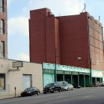
A large, windowless brick building on East Main Street is ready to move forward as a mix of condos, apartments, office, and retail space after gaining approval from the Waterfront Development Corporation, the agency tasked with overseeing development in the area.
Ice House Lofts will fill the seven-story former Arctic Building at 217 East Main Street with a mix of uses including condos, apartments, office, and retail space. The $10 million project is being developed by David Barhorst of Sofo Development and David Steinbrecher, owner of Derek Engineering and the first residential units could be available by the end of 2010.
Development plans have been evolving but Barhorst explained the proposal calls for a mix of 36 apartments and condos on the first six floors and two penthouse condos on the top floor. Already, Barhorst is talking with one person interested in purchasing a penthouse unit.
Commercial space will line Main Street and Washington Street and a former ice manufacturing plant in the back is expected to become commercial space. Negotiations are under way with a prospective tenant but Barhorst declined to name the interested party.
Along Main Street, Ice Box Co-Labs, billed as Louisville’s first co-working environment, has already taken 5,000 square feet and will soon have a new glass facade along the loading dock portion of the structure. Crews demolished a brick wall for the window last year and it is currently covered in plywood. The co-working concept includes spaces for individuals or small groups to have offices, three conference rooms, a photo studio, and the very important ping pong table and Star Wars pinball machine.
Several non-contributing additions on Washington Street will be demolished and Barhorst says he hopes to build a small parking garage with about 100 spaces and retail space along the sidewalk. Barhorst and Steinbrecher have hired a consultant to study the layout of the garage. His earlier promise to promote bike-commuting at the Ice House still stands and he says bike lockers will be included.
When we toured the building in 2008, Barhorst pointed out the massive concrete structure inside the ice warehouse and explained how old machines still inside the building once made giant blocks of ice. Some of the old refrigeration machinery like chillers on the back of the building will be removed but Barhorst wants to keep other elements as a nod to the structure’s history. A massive steel structure holding up the chilling units on Washington Street could become a roof deck for tenants.
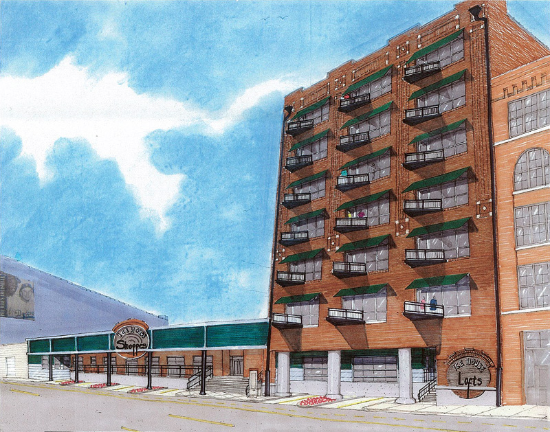
It’s going to take a little effort to transform a building with no windows into a comfortable place to live. As you can see in the rendering above, Ice House Lofts will have a grid of windows cut into the facade in a manner that respects the existing brick detailing. Each unit will feature its own balcony and the penthouse units will offer three balconies each. Design work is being handled by Bayus Design Works of Louisville.
Located between two of the most expensive residential projects in Downtown, the Fleur de Lis and the Waterfront Park Place, units at the Ice House Lofts offer more moderate pricing. Units will primarily offer one bedroom and range from 680 to 1,100 square feet. Rents are estimated at under $1,000. Condos on the upper floors will start at $250,000.
Barhorst and Steinbrecher are currently in negotiations with two banks to secure financing for the residential component of the project, but work will proceed on other aspects in the meantime. Telephone switching gear located on the top floor will be relocated to the roof and the glass facade along the sidewalk will be installed. A routine approval of the project floor plans must also be undertaken by the city.
Work on the residential units will begin when financing is finalized and upon final approval from the city, but Barhorst says if everything goes well, the first units could be available by the end of the year.
Check out more coverage of the Ice House Lofts on Broken Sidewalk.


That new design doesn’t look very good.
there does seem to be too much of an attempt to pretty up a perfectly respectable industrial building. no problem with the openings or the balconies, necessarily, but what’s with the overscaled not-quite-doric columns, ye olde style ‘shoppe’ awning, and the applied-stone suburban-shopping-center-ready signage at the base?
probably less expensive and maybe better to let the building be what it is – strip it back to the essentials and add only what makes it a comfortable, convenient place to live. isn’t that part of the charm of loft living?
I believe the columns are staying the same as what’s there now. The massive ones on the east side are made of concrete and the other half has steel columns. I can’t quite tell what’s going on with the area above the columns on the shops side, but I think they are trying to keep the industrial feel – the loading dock remains as will the brick sidewalk. The major change is the addition of a window grid on the tower and balconies.
Hopefully it’s just the rendering, but it does have a Courtyard by Marriott feel. It will be blazing hot on the south side, so are the balconies really necessary?
I’m sure it will be just as successful as all the other condo properties along Main Street.
Marriott Courtyard is exactly right! One of the appeals of that building is its grand blankness. I’m reminded of Kodak’s huge windowless Building 29 in Rochester. They made film there, so it had to be totally black inside. There was something monumental about that expanse of uninterrupted brick.
http://www.urban-photography-art.com/kodak-park-building-29.html
Alas, it was being torn down as we left Rochester in ’05.
I would love to see something of that blankness maintained at the Ice House. I’m no architect, but I’d like those three vertical panels to become three glass windows (I know they want light and views of the street). Put patios out the back – to see Thunder.
Thank you all for yor comments. This rendering is not the final design as I stated to Branden. I didn’t like the retail facade either. We have added a metal entrance and brushed metal band along the facade above the shops. And yes, I didn’t like “shoppes” either which has been changed to “shops”. As to the balconies, we have learned that it is a nice amenity for each unit to have the ability of stepping outside. Courtyard by Marriott? LOL. Is it the green? In some respects that is a great compliment given the design challenges of transforming this massive piece of solid concrete and brick into something hospitable.
As to the success of selling the condos, the majority of our lofts will be for rent. The lofts for sale are moderately priced. Given the interest already I am confident that we will rent and sell them.
Thanks for the response, David. The clarification on the retail side makes much more sense.
I don’t think trying to play up the monolithic windowless facade should be encouraged too much, Ken. On the other hand, it is important to respect the building’s history. In the end, people will be living here, so windows are going to be required.
Personally, I think the rigid grid of regularly sized windows and balconies will create a pattern from the sidewalk POV that’s interesting and can convey monolithic qualities.
Finally, I think that having balconies is great, especially considering these units are more moderately priced than many in Downtown. Part of keeping prices down is keeping the units sized appropriately, meaning they won’t stretch the length of the building N to S, so balconies on both sides are required. The ability to step outside while in your own home can’t be overhyped.
Personally, I think the balconies are a little dinky and trite – especially with the triangular shape which is really a worthless and usuable shape for a balcony in some regards.
I’d make the balconies the entire width of the window bay, make them as deep as possible, use them as a brise soleil element and ditch the awnings all together.
I commend the developer for making the effort – especially in what are still tough economic times. Good Luck.
Any plans for the ground level space at the corner of E Washington and Floyd? That could be a heck of a spot.
I think you might be surprised as to the size of the balconies. We wanted to make sure that the total window was not blocked by a balcony obstructing the view of the street as well as keeping down costs. I understand your point as to shape but differ with you as to unusable. From the street the triangular shape is much more interesting than right angles. I appreciate your brise soleil idea. Thanks for the input.
Yep, yep… I was letting a personal fetish for expanses of brick get in the way of sound architecture. I really should be careful not to expose my personal issues!
I can definitely agree there is a sort of dystopian beauty in giant windowless buildings, Ken. You might enjoy 33 Thomas Street in Lower Manhattan that takes the concept to the extreme.
It's 550 feet tall and has no windows at all. It was built in the 70s to house telephone switching equipment but is now obsolete due to technological advances. (The nearby 375 Pearl Street building is a close second for windowless monoliths.)
Ah, yes… perfect. I think I got this obsession from loving films like Antonioni's Red Desert… and maybe from Moby Dick, my favorite novel: the blank abyss. You know, for a study of space and blankness and enclosure, I recommend Wim Wenders' Paris, Texas. Oh, and Tarkovsky (http://www.youtube.com/watch?v=iFAlegTEBUU)...
Sorry, a bit off topic, eh? Maybe not.
I’m going to have to say that I appreciate the simplicity of the added design elements. It is still the same building. And I really love the way the loading dock is utilized and woven into the function of the building, rather than overhauling the facade.
No street trees?
East Washington St. does present opportunities for retail. We recently changed our focus on the ice making warehouse that fronts E.Washington into commericial uses and look to have small retail at ground level in the garage. Trees? good question. We are working with DDC to keep the brick grade in front of the loading dock. DDC is doing all new sidewalks ( I guess everyone around the arena except Iron Quarter) and we are working with them as we speak about a curb cut in the new sidewalk that would allow parking on the brick in front of the dock. Landscaping is being discussed in this process.
I like even though its shape looks a bit stiff
Came for retro-look after just reading that developer has been granted a small-business loan.
Surely the old factory whistles will be incorporated into the new design?
I think grey awnings would be attractive. And I hope that as many environmental aspects as possible will be included.
I go to Stevie Ray’s quite often and I will enjoy seeing the transformation of this building.