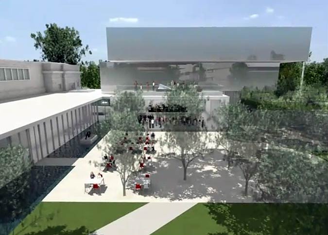
After an altogether not-that-speedy wait, the final design for the much-anticipated Speed Art Museum will formally be revealed tomorrow at a public forum (more on that later). My colleague Alan Brake at The Architect’s Newspaper found a teaser fly-though video showing in not-quite-high-def detail plans for the new structure sitting just north of the Speed’s historic Beaux-Arts building. Designed by wHY Architecture from Culver City, California with Reed Hilderbrand landscape architects, I must say, this bit of a tease has me thinking it was worth the wait.

As you can see in the video, the new building will offer a restrained modern approach that dually offers a monumentality and transparency along Third Street that will help it blend with the original structure’s heavy stone, better connect the campus to the surrounding neighborhood, and provide the scale necessary for a major thoroughfare.
If you want all the details on the new museum’s design, head on down to the Speed tomorrow morning at 10:00 am to see an undoubtedly better fly-through and hear the architect Kulapat Yantrasast speak. (Reservations required.) Barring that, an exhibition called Unveiling the New Speed: A Model of the Future will be running that “allows visitors to explore the Museum’s Master Plan as it embarks on the largest capital project ever undertaken by an arts and culture institution in Kentucky” will be running all the way through March 11, 2012.
But what we know on a Friday night (and all I may know for a while being stuck in New York), is what we see below. Kulapat Yantrasast has worked with uber-famous Japanese architect Tadao Ando in the past, an influence that is clearly seen in some of the firm’s more concrete-intensive work, but it looks like the Speed offers something lighter, but not lacking in Ando’s restrained touch.
Visible in the video is a large reflecting pool on Third Street that pushes through the addition and onto a campus-side plaza dotted with a grid of trees. Other intriguing details on Third Street include a bermed wall of amphitheater-style seating and what looks to be a pretty amazing grand stair. (Any Broken Sidewalk sleuths want to report back this weekend? Tips@brokensidewalk.com is the drill.)

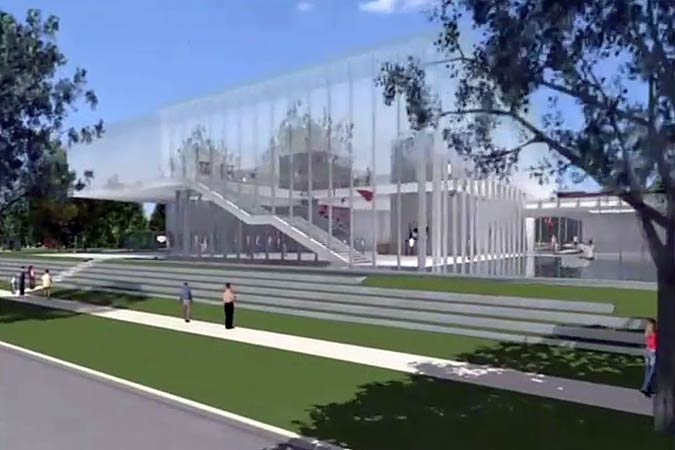




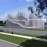

Can they please say away from the Brutalist architecture that currently reigns around U of L and a lot of downtown? Doesn’t look like it. During the video, at the very beginning, the first drive around show the cantilevered upper floors, the blocky glass windows, striking repetitive angular geometries. Why can’t they make it match, in the neo-classical Beaux-Arts style, Speed building?
Does that really qualify as Brutalist? In Louisville, I think of the downtown library as Brutalist. This seems cleaner, more modern, and glass seems to play a larger role in the materials used. That genuinely is a question though as I my only guide in the matter is Wikipedia. So, is it really Brutalist?
Well, the only thing I base my viewpoint off is the teaser video with see-through walls, I’m just guessing it will be concrete and/or glass.
The downtown library is brutalist, along with many of UofL buildings, the Jefferson County District Clerk/Court House, one of the Humana buildings downtown (also not sure which one), and many others.
The proposed addition can’t be considered brutalist. Brutalism was a style of architecture that isn’t really practiced any more – for many obvious reasons. Louisville does have some good and bad examples of the style. The justice center downtown is a good example in my opinion. (The brutalist Humana building you mentioned is the one that was torn down for the arena.)
The renderings of the new Speed appear to be heavily reliant on glass. (And it looks like there could be some concrete, but that doesn’t automatically mean brutalism.) The closest references I could think of when looking at the renderings would be to the “stacked boxes” style that has recently become popular. (Check out the New Museum in New York, or even Museum Plaza.)
I would be reluctant to wish for a stylistic match to the Beaux-Arts Speed for quite a few reasons. A matching addition would require expert knowledge of classical styles, which isn’t widely known today. Any cheap knock-off of the Beax-Arts would cheapen the entire ensemble into some sort of Disneyland museum. I think this addition includes many sophisticated architectural techniques to connect to the old building. It also appears to blend with its landscape in a nice way as well.
I went to the presentation this past Saturday and saw the model of the full plan that is on display. There is nothing Brutalist – or even brutal – about the plan. The overall effect will be a lightened, welcoming visage. Part of the directive for the plan (besides keeping it as green as possible) is to make the museum feel alive and open to the campus and the neighborhood. 5000 to 7000 people pass the museum – more walking traffic than any other spot in the city. The old mausoleum of a building – and the later additions – never called to passers-by to come in. Art Sparks, the store, the restaurant, the auditorium, the collection are draped in concrete and labyrinths. As the video shows, the glass, the water in the moat (only an inch, but, over recycled black marble, will look quite deep), the rich landscaping, the seamless move from new buildings to old – all will from inside and out make the museum seem a part of the life of the campus and the city. It will be a great recruitment tool for UL, and a clear destination for tourists – especially if, by the time it’s all built, there is some kind of fast mass transit from downtown straight up 3rd.
Ok, well good. I was hoping it was brutalist. Thanks everyone for the conversation!
@Ken Wilson – The moat looks really great in the expanded video. At the presentation were any green features mentioned? Are they striving for some level of LEED certification?
LEED, of course, came up, but they were reluctant to predict a level, understandably. As Kulapat made clear, museums are about the hardest enterprises to keep green there are: 24/7 temperature and humidity issues, and lighting that is not harmful to the collection, but comfortable for observers.
That said, they are making a concerted effort to keep materials as green as possible and as local as possible. The marble I mentioned will come from an existing part of the building that will be torn down. Captured rainwater will fill the moat and be stored for other uses under the moat. There are other moves I’ve forgotten, I’m sure.
wHY Architecture and Kulapat Yantrasast were chosen in part because of their commitment to green architecture. His firm did the Grand Rapids Museum, the first museum to get a Gold LEED.