Located on the corner of Rubel Avenue and East Broadway in the Original Highlands, a row of modern townhomes dubbed the Phoenix Lofts are finishing up with construction and one sold unit is already occupied. I recently had a chance to tour a model at the five-unit development and was pleasantly surprised by the modern quality of the interiors.
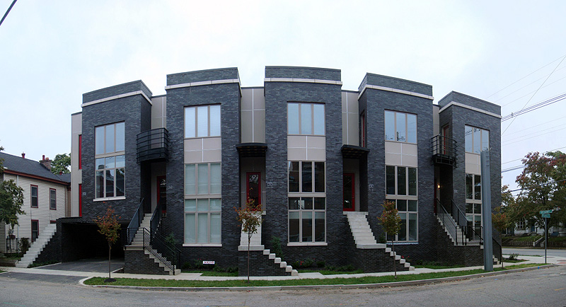
Developed by Marian Development Group, the Phoenix Lofts have been designed to bring a modern sensibility to a traditional urban form and neighborhood. Four two-bedroom units and one single-bedroom unit now occupy a corner parcel that previously housed a gas station. Environmental remediation took place before the site was considered. Kimberly Stephenson of L & J Constructors explains that the site was chosen for its proximity to downtown and the Highlands.
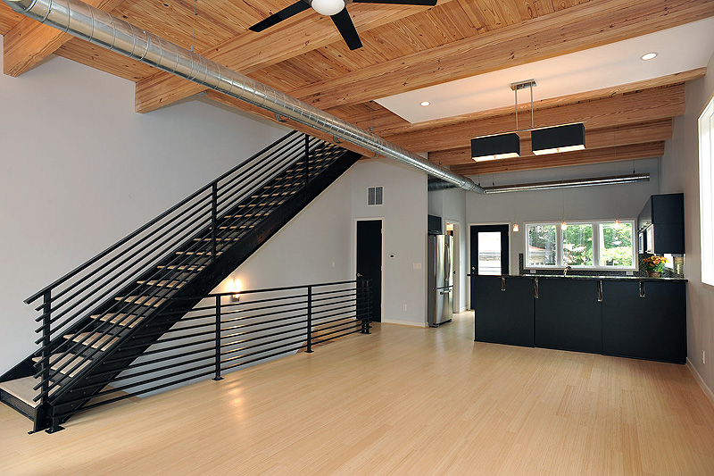
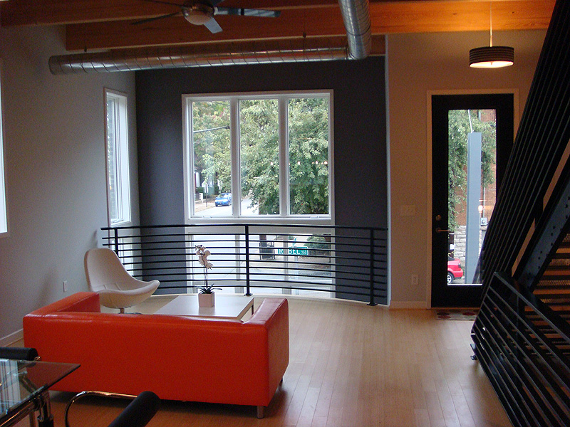
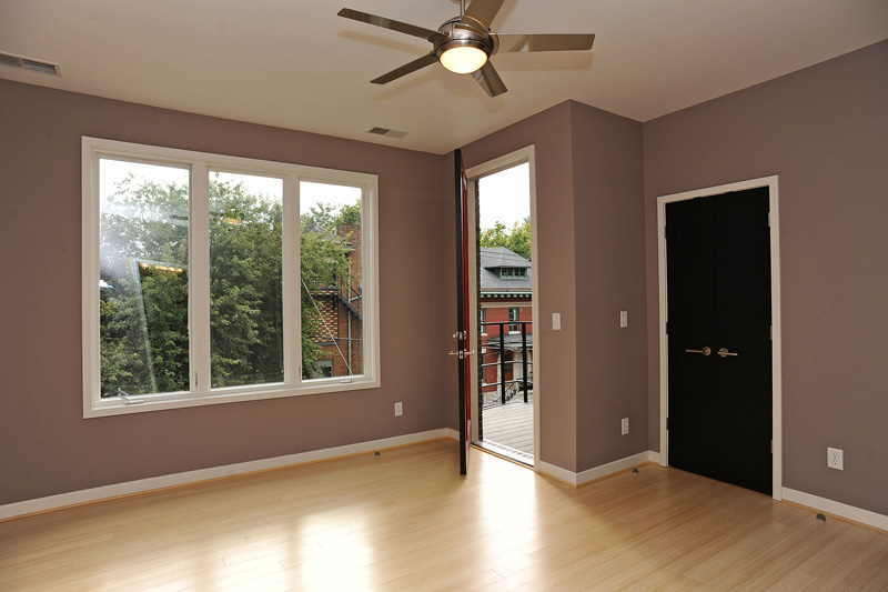
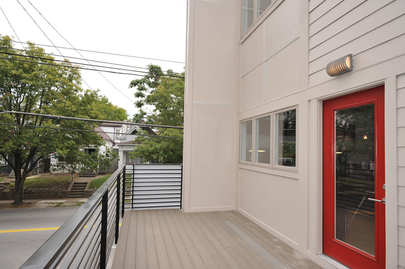
The building’s exterior is divided into five vertical masses clad in black brick and limestone to delineate individual townhouse units. Entry into the building is on the second floor placing the main living spaces in the center of each residence. An open floor plan creates a loft-like space that is also open to the first floor. The top level contains bedrooms, two bathrooms, a laundry, and a balcony facing Rubel Avenue provides views of the surrounding neighborhood.
Stephenson says the development process has gone smoothly as the parcel was zoned appropriately for the infill project. One setback occurred last year as the development team struggled with the death of of a partner, causing a hiatus in construction. Stephenson says the neighborhood has been supportive of the project but admits some were startled by the choice of black brick who preferred a more traditional red brick exterior. In the end, the contrast of dark brick and light detailing creates a sleek, modern appearance.
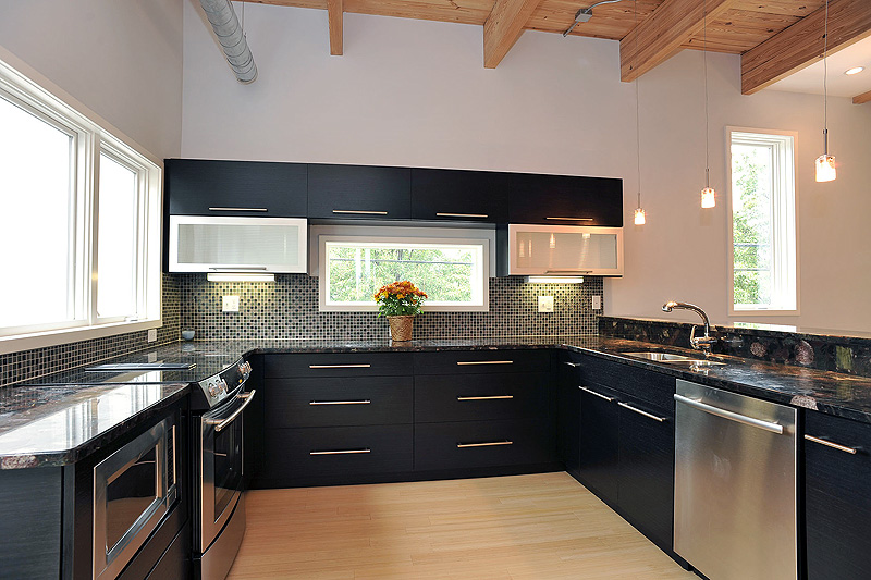
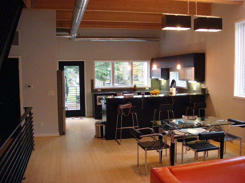
Interior spaces at the Phoenix Lofts were designed to create a big-city feel yet offer more living space than can be found in cities larger than Louisville. The kitchen, dining room, and great room feature a warm wooden ceiling with beams and bamboo floor meant to evoke construction of historic warehouse spaces. Exposed ductwork, metal railings, and dark cabinetry help reinforce an industrial feel. The modern kitchen is complete with stainless steel appliances and details, intricate tile work, and hand selected granite counters.
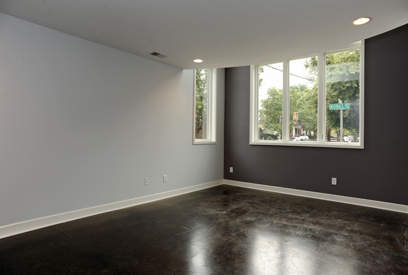
Justin O’dell of Keller Williams who is representing the development said the four remaining units range from 1,300 to 1,570 square feet with prices from $269,000 to $339,000. A parking space is included and two bedroom units have their own garage. Condo fees range from $150 to $180 per month. A corner two-bedroom unit features extra windows and is marketed at the same price as other units. Interiors of three units have been shelled and await the custom build-out of future owners.
- Phoenix Lofts (Official Site)
- Development Watch: Phoenix Lofts (Broken Sidewalk)
- Development Watch: Phoenix Lofts In The Original Highlands (Broken Sidewalk)



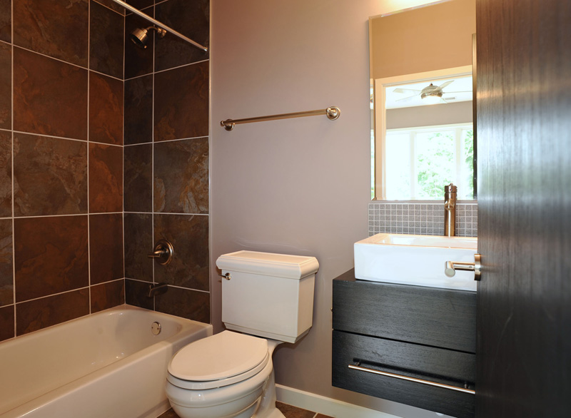

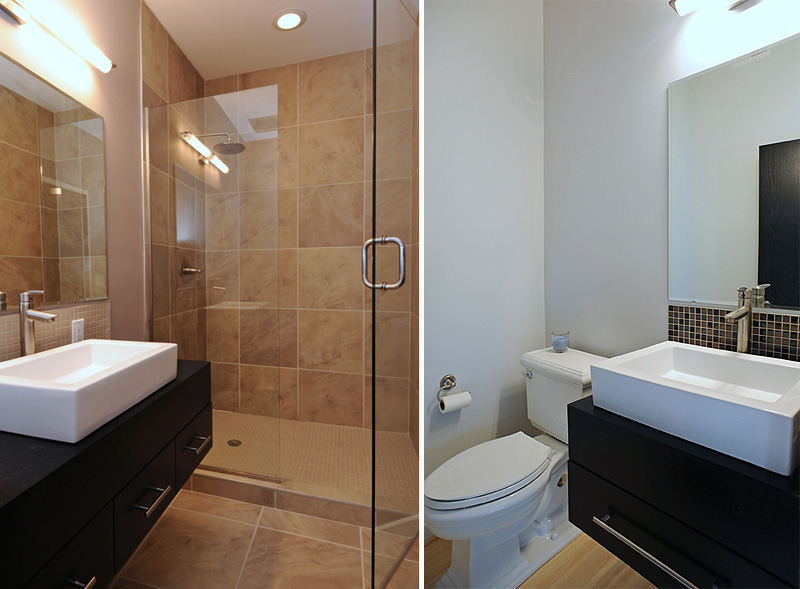
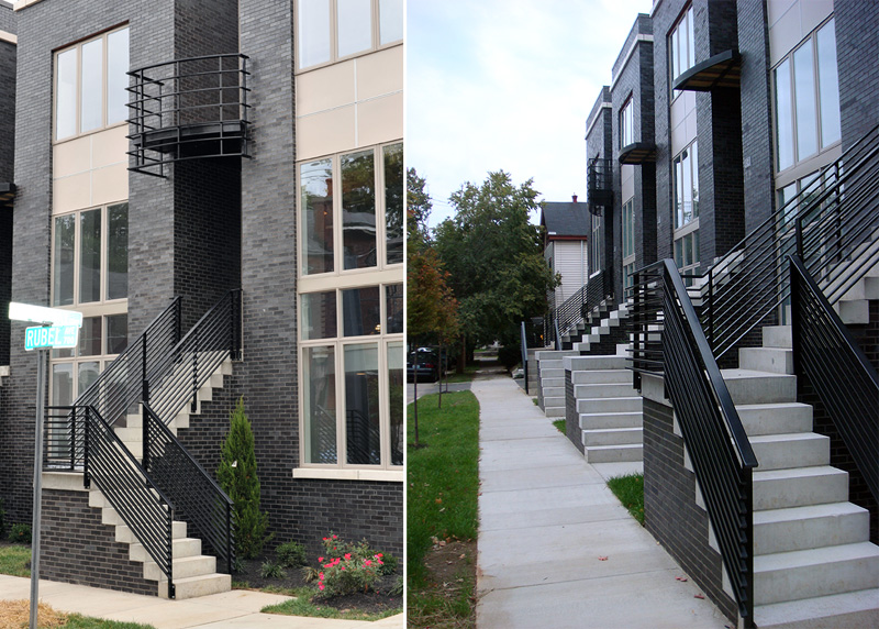


I appreciate the effort put into these units, but would it have killed them to turn the corner and put one of the condo’s facing Broadway?
Looking at the site plan on the developer’s website, they also have a curb cut for the parking lot access on Broadway – why not onto the side street? Also, raising the unit entries to essentially the first floor above grad to accommodate the parking garage is very awkward – as is the garage at the end.
Again, Louisville needs more infill projects like this – but developers need to make the extra effort to work within the existing context and urban fabric
Matthew, I probably should have pointed out that the development web site is out-of-date including the site plan. There is no curb cut now on Broadway, just the one on Rubel to enter the “drive-through” to the back of the building. Regarding the garages themselves, all I can say there is that I vastly prefer them to a surface level parking lot and I admire how the project brings a good amount of density to the site without feeling overcrowded.
That said, I have to agree that the one big room for improvement in the design is how it turns the corner from Rubel to Broadway. Like you, I always prefer when special attention is paid to such conditions. The corner unit may not have to turn fully to face Broadway (a higher traffic and perhaps noisier street than Rubel), but some gesture could be made.
In the end, though, I am still really pleased with the overall design and would like to see similar quality projects infill other parts of Louisville. I am happy to see the townhouse typology making a comeback.
On a final interesting note, a couple houses half a block from the building on East Broadway are clad in white glazed brick with blue and red detailing. The unexpected brick makes them unique and quite interesting, similar to how the black brick on this structure works today.
Thanks for the info Brandon. I don’t live in Louisville anymore, so I haven’t driven by the site in a while. Looking at the photos now, I see what I thought was a garage is in fact the entry to the parking area in the back.
I still think the stairs up to the second level are odd, when they could have had a small entry room at the front of the house with the garage behind, and internal stairs up to the main living level.
All that said – it’s not a bad effort, the scale seems decent, and the developers made a good attempt. Let’s hope they learn from this try and do it even better next time.
What happened to the original realtor Allen Mertz? Didn’t he find the site originally?
I believe he moved to Washington DC some time back. Not sure the history of who found the property.
Technically speaking, this development is mis-named. 😉 The south side of East Broadway is part of the Original Highlands neighborhood whereas the north side is in the Phoenix Hill neighborhood. Early ads even said something to the effect of “in the heart of Phoenix Hill”. I wrote at the time to help the marketers correct this, but it was too late to change the name.
I think they’re sharp looking, but I too was disappointed in how that corner unit (mentioned above) treats East Broadway. It comes right up to the sidewalk on East Broadway, no doubt a concession necessary to squeeze in that fifth unit. However, that huge expanse of wall, combined with all the electric meters sticking right out on the sidewalk, make it less than nice looking from the main artery. Why weren’t the electric meters placed in the back of the unit or in the pass-through? You would have a hard time finding a more prominent spot for that mess of LG&E meters.
Just an FYI… When last I heard, Phoenix Hill Tavern was still planning on tearing down the two story white house directly across Broadway from these condos to enlarge their parking lot. I wish they’d reconsider doing this because it’s certainly not going to be an improvement in the aesthetics of the block.
Best,
– Chuck