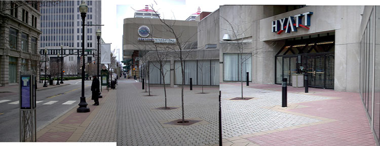
In what’s being billed as the first major renovation of Downtown Hyatt since it was built in 1978 is in fact cementing in place a mistake we had hoped was left behind in the 1970s. We’re not concerned with new the hotel’s new interior or its new farm-to-table restaurant called Sway (for Southern Way), but rather what it is forcing of the hapless pedestrian passing by.

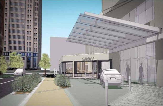
What was once a nondescript pedestrian plaza studded with small trees on Fourth Street at the building’s entrance between Jefferson and Liberty streets has been replaced with a driveway. The hotel already had a “motor lobby” accessed mid-block where motorists can drive drive into the building and then into the parking garage, but apparently, more car access was required. No longer can you leisurely stroll along a wide pedestrian sidewalk. Now you will be held at arm’s length from the building itself, funneled into a narrow expanse between two rows of shrubs and forced to dodge distracted tourists trying to navigate narrow Fourth Street. It’s a shame this kind of thing was allowed to happen at all.


So the off-white/yellowish strip isn’t the sidewalk? I’m not fully understanding what you’re saying the new pedestrian path is going to be. If it’s the strip I’m talking about in between the two sets of shrubs, that looks like ample room for pedestrians. I don’t know what else that would be illustrating besides a sidewalk. Am I missing something?
I believe Branden is lamenting the loss of the whole “plaza” as pedestrian space. But, as someone who works downtown and walks that way often, I have to agree with Ben. Most pedestrians who aren’t going in or out of the Hyatt only use the space between the lampposts and the first row of trees. The yellow sidewalk space is not much smaller, and I can’t see it posing that much of a problem.
Yes the yellow strip is the sidewalk. It’s certainly not generously sized by any means but it does look like two people could walk side by side. Simply saying that most pedestrians don’t fully utilize a space, so converting it to a driveway isn’t a big problem is missing the point. What other spaces around town aren’t being fully utilized? Perhaps we could turn them over to automobiles as well.
That this space isn’t being utilized to its potential is a factor of it’s (and the building’s) poor urban design. Now that a restaurant is set to occupy one of the low wings flanking the plaza, part of the space could be set aside for al fresco dining. A food cart could provide activity to the sidewalk. Benches wouldn’t be a bad addition, either, although I suspect the hotel would prefer some people not use them. The driveway also serves as a barrier to brush away undesirables that might happen by.
I have to respectfully disagree. I see these plans as an improvement to not only the hotel, but to downtown as well. Not sure I get the concern about the undersireables either. In fact I wish they’d reinstate the fare on the Main/Market trolley buses for the same reason.
Branden- Has this already been approved by city? Cause I kinda wanna stop it.
I noticed the plans were put together by Bravura, whose lead architect, Ed Kruger, serves on the Downtown Development Review Overlay District Committee.
I am as pro pedestrian as anyone (i.e. equal shareing of space with cars), but there are plenty of other places nearby for lounging, walking, dining alfresco, etc. I imagine this “improvement” will help the Hyatt stay competitive, so kuddos to them for spending money in our downtown, which in not so many years ago was definitely not the trend.
I will never understand why so many Louisvillians spend so much time trying to impede change. The end result of change may not always be good, but the action of change is.
@Karl Keeling –
I agree. That area needed an update. This isn’t 1986 anymore and the entry to the Hyatt was disturbingly outdated and was in need of remodeling. I work downtown, I never see people just hanging out by that “plaza”. Except for the drunk homeless guy playing his electric guitar. That usually scares everyone off. The only use that section of 4th street is to shuttle working people to 4st Live for lunch and then back to their offices.
And yes, they have already begun construction.
Why would you want to stop this? Please.
I can’t believe you can make the argument that Downtown has so much pedestrian space already that we can start turning over more of it to cars! Please. It’s true that the building’s entrance was terribly outdated, and putting on a new glass curtain wall and canopy will certainly improve it and is welcome, but to think that we need to push cars 10 feet closer to the front door at the expense of pedestrians is absurd, especially when there’s already a dedicated automobile entrance just around the corner. Plenty of other great hotels in Louisville like the Seelbach and the Brown do just fine without driveways at their front doors.
The plaza space was poorly designed, just like the entrance itself. That doesn’t mean it should be removed. It means we should require our architects and planners to put more thought into the public realm, not turn it over for a parking lot. That the city allowed this to happen is a clear demonstration of how far we have come in urban thinking in this city when the national trend is the complete opposite: removing auto-centric space in favor of expanding pedestrian space. What a blemish on Downtown and the city.
I agree with Branden. This is a clear loss for the public realm. While it is good that the Hotel is being renovated, this suburban-style drive-up entrance erodes the pedestrian experience. Yet another bad decision of Fourth Street.
You should have included pictures of the plaza with at least ONE person in the area to support your argument. This is a non-issue.
@Ben – You are correct, the yellow band in the rendering is a devoted pedestrian sidewalk. This sidewalk is 6’-8” wide at the narrowest point between the two planters and increases in size to 12’-0” between the permeable paver strip and the edge of the hotel. The paver colors were selected to create a visual cue to pedestrians and drivers that the sidewalk takes priority over the driveway and the driver needs to be wary of people crossing the path.
@Karl Keeling – That driveway is WAY deeper than anything on the Seelbach or the Brown. Besides, neither of the historic hotels push the sidewalk away from the entrance and force pedestrians to dodge automobiles pulling in. This is clearly an example of putting the needs of the car first.
@Neal Johnson – I assume your problem with the “drunk homeless guy playing his electric guitar” is that he is homeless, and from your perspective, it seems you think he is in need of displacement because of that condition? And that’s what this modification is really about, isn’t it?
Instead of investing in plans to end homelessness, Louisville’s going to protect the rich from the threat of reprisals from the people who were discarded and exploited to make them rich in the first place. I’m really surprised you aren’t just shooting them in their sleep.
I see it as poorly illustrated and disappointingly designed. This looks like 5 minutes of effort. The space could be richer in pavement textures, have trees (!), and pedestrian-oriented amenities. This looks like an airport drop-off from the 60’s! And haven’t we seen this canopy design enough in Louisville? This is already looking dated and they haven’t even finished building it yet. Geez.
As a true pedestrian (not someone on their way to a car or to the nearest bike rack), I disagree there are many pedestrian friendly spaces downtown. It would have been nicer if the hotel had invested in making the space more pedestrian friendly and a piazza style place where folks could enjoy the outdoors on a nice day. Louisville continues to gravitate towards car oriented, concrete laden remodeling. Such a pity.
In the summer there are chairs and tables in this plaza. On a nice day they fill up. The pictures from a winter day do not do it justice.
@curtis morrison – Um, what? Step away from the ledge. Don’t you have to go occupy something? No one said anything about shooting homeless people. I just cant stand when the drunks think they can play guitar when they can’t.
I am as much a pedestrian advocate as the next Broken Sidewalk reader, but let’s be real here…
In an ideal urban world, it would be great to fill every “nondescript pedestrian plaza” into a bustling piazza filled with overflowing cafes and benches of people reading the newspaper. But that is highly idealistic.
The Hyatt should be applauded for activating this once-dismal space even if it includes the automobile. This is not a public city-owned property, but one owned by a corporation that has chosen to invest in Louisville’s downtown and to expand upon the 4th Street Live corridor. This new design will not only give the Hyatt a much needed update, but will give the hotel a presence along 4th Street. Although it will involve the automobile, the new scheme will activate the space (that not even the previously existing trees could help). For the casual downtown urban space dweller who is looking for a place to read a paper, take an office break to bask in the sun, or to merely people watch, they are going to choose the public urban park just a half block away- at 4th and Jefferson. Even with the greenest lawn, most beautiful trees, and most expensive assortment of pavers, benches and tables, creating a pretty plaza is not always the best solution for underused urban spaces.
The new design will take the activity and foot traffic of arriving guests/ visitors from within the hidden drop-off and add it to the activity along the 4th Street. Hiding this activity within the hotel parking garage is akin to elevated pedways that remove that urban activity from the street level and kill the hustle and bustle we all desire within our urban environments. This unloading and loading from a car is an unavoidable function of a hotel, so why hide it? Why not exploit it and add it to the daily street activity amongst the pedestrians? I believe the two can co-exist in the same space. I have walked through many European piazzas where the two co-exist; this can be achieved with colors and texture in the paver design. It is idealistic to envision a car-less world and I’m not sure that is what we would really want. Imagine NYC without the vehicular movement and activity… There is a way to merge the world of the car and pedestrian together and I think the Hyatt has done so nicely in this design.
Let’s not also overlook the fact that the hotel will also feature a new restaurant S’WAY (in a once highly underused store front space within the hotel) that will fully open onto the hotel’s new arrival court with a nano wall system. The bar and restaurant patrons can now engage 4th Street Live and the pedestrians passing by that they could not do so before.
And lastly, let’s not blame the architect. I am sure the Hyatt came to them with this project in hand. In this economy (with architects being amongst the highest percentage of the unemployed), I doubt they would turn the project away even if it was as pedestrian-unfriendly as many of you are making it out to be. And if the architect had, I’m sure there would have been another architect or even worse- one with less skill or eye for design- that would have executed the project with even less attention to detail.
I don’t believe it is idealistic to say this design (as shown in the illustration/video) is uninspired. As an example where a hotel vehicle turnaround was well done, just head over to the Marriott Downtown. Though it is five years old now, it will still be better than this. This is Fourth Street — it should be pedestrian-oriented, artful, and articulate. Losing a half dozen trees (even Honey Locusts) to a driveway is, well, sad.
Everyone is doing more with less — that should encourage a more inspired design. Bollards and Bushes just don’t cut it. I’m hoping Hyatt’s GM, the architect, or the city’s Downtown Management District will suggest and implement something better.
@John Pacyga –
Are you talking about the Marriott Entry on Jefferson? With all due respect that space is dark and “uninspired” to use your hackneyed catchphrase. And, as it happens, I was almost hit by a car pulling out there due to the darkness of the turn-around. I am not here to criticize the Marriott’s use of their property, I am just pointing out a flawed argument on your part. And the design tools used to articulate that space was a single paver color/pattern, a monochromatic/brutalist overhang with no thought given to natural day lighting and tubs of planters thrown in for color. So your criticism of the Hyatt design applies to the Marriott Design as well.
The Hyatt’s drop-off drastically improves upon what can be learned from the Marriott. First, the sidewalk allocated for the passing pedestrian is wider than what was used at the Marriott. The pavers for the Hyatt space are also much more varied than the swaths of concrete at the Marriott; the pavers at the Hyatt vary in scale, texture and color for visual interest and act as cues to the pedestrians and drivers as to how to transverse the drop-off. The paving at the Hyatt is definitely “pedestrian-oriented, artful, and articulate”. Secondly, (and most importantly) the Hyatt’s canopy is glass. The Marriott’s drop-off is blanketed by a heavy canopy which prohibits any light from penetrating back into the space. The result is a very dark and uninviting space that is not welcoming to the hotel guests or to pedestrians. And as far as bollards and plantings, the Hyatt uses a similar strategy and I cannot see how the Marriott’s could be deemed more successful???
@Porter Stevens –
By pushing the driveway further in, you keep the pedestrian crossing distance to a minimum without alternating the walking path. If the driveway simply cut into the existing sidewalk, the pedestrian would have to detour toward the Hyatt or walk through the cutout. At the Brown and Seelbach, the cutout stops shy of the sidewalk because the sidewalks hug the building facade, unlike the Hyatt.
Either way, pedestrians and cars interact at street crossings already, so I dont see a problem.
The Hyatt Regency Hotel Opened yesterday. It would be interesting for critics of this project to weigh in on how the new drive, canopy and restaurant entry affect the atmosphere of this section of 4th street.
I walk by almost daily to catch the #17. Will definitely check it out in the next couple of days. Was still under wraps the last time I walked by.
We’ll see. The brickwork looks great and inviting, but what is the car circle going to be used for? If it’s just for an occasional dignitary, that is one thing. If it’s going to become the taxi stand and/or valet parking zone, then it’s going to a terrible burden to the block – and really make eating outdoors at Sway unappealing. As it stands Sway is tasty and enjoyable (ate lunch there today), and windows popped out, it seems like a cool (but hotel inflation priced) addition to the road. The canopy is fine, although I think the tan color doesn’t match the rest of what went in. Silver metal, or gray paint would have fit in much better into the rest of the renovation. The concrete building above the canopy looks all the more dingy for the canopy’s presence, so hopefully there will be a phase two to address the rest of the building.