There’s been a lot of discussion lately about what makes an active or vibrant streetscape, specifically as it related to the new Omni Hotel & Residences now approved on the old Water Company Block. And the suggestions about active streetscapes have ranged from adding benches, public art, and other pedestrian amenities, to ensuring a lively street wall with retail space and storefronts, to whether designer garage doors and fake retail can achieve the same thing.
Now there’s scientific evidence we can look at in making these decisions, fresh from Journal of Planning Education & Research. Researchers’ studied 20 different streetscape features in New York City—from street furnishings, facade activity, plazas, even building color—and then compared them to pedestrian counts on 588 blocks. The results, they say, are what most often attracts people to a place.
According to Next City‘s Josh Cohen, the study looks at the difference between “design elements [that] are bringing the crowds and which are just corollary.”
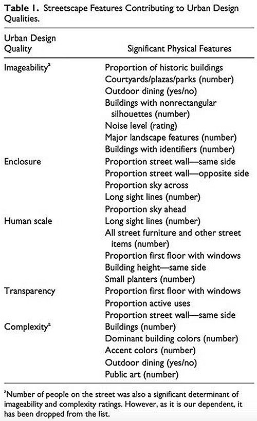
To study the public space elements, researchers created five overarching categories—”imageability (how memorable a street is), enclosure (the degree to which buildings enclosing the street make it feel room-like), human scale, transparency (the proportion of first-floor windows), and complexity,” according to Next City.
“New York is the most walkable city in the United States and it has a lot of the urban design qualities that we’re talking about,” Reid Ewing, a researcher at the University of Utah, told Cohen. “It represents kind of the best case in the U.S. for these urban design qualities and associated pedestrian traffic volumes.”
The result? Only three of the 20 streetscape design elements positively affected pedestrian activity, after controlling for density, diversity of land use, demographics, and destination accessibility. Cohen described the findings in his Next City post:
They are: the proportion of windows on the street, the amount of “active street frontage” and the quantity of street furniture. As is often the case with social science, the results help quantify some common-sense notions about urban design — in this instance, that people want interesting-looking streets at a human scale with places to go.
Windows are important for creating a welcoming interaction between people and buildings. Blank walls and reflective glass are boring and uninviting. Active street frontage — shops, restaurants, parks and similar — are critical for generating foot traffic. Ewing puts them in the category of imageability (how memorable the street is) and says memorable streets draw people. Street furniture such as benches, signs, lampposts and trash cans help keep the street at human scale.
“I would’ve expected more of the variables to be significant,” Ewing told Cohen. “They all sound pretty reasonable when you think of them: having courtyards, plazas, parks along a street. But the three variables that I proved to be significant are the only ones that are significant.” Or at least “statistically significant” to the study. “We’re not saying [other design elements] are not practically important. They’re just not statistically significant in our study,” Ewing added.
Ewing called for further study of public space design issues, and it would certainly make for an interesting research project to replicate in Louisville. Check out the full results in the article “Streetscape Features Related to Pedestrian Activity.”
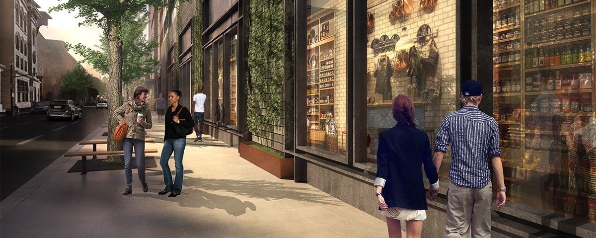
[Top image: Rendering of Third Street between Muhammad Ali Boulevard and Liberty Street at the Omni parking garage. (Courtesy HKS).]


The more the rendering suggests activity in a faux environment of pasted on doodads the worse the reality when its too late…!
A wise man once told me that the secret to good urban planning is to provide a place for men to sit and watch women walk by. This study pretty much proves that out.
I like the emphasis on “human scale” here. It’s very easy to forget. The joke in Zoolander about the “center for ants”, I think in reverse is the reality more often than not: We look at a model or rendering and by default try to picture it from human scale using whatever hints our brains think are there. It’s very easy, I imagine, for a design to get Reverse Zoolandered with familiarity (“this is a building for people”) and lose sight of the actual objective scale of the thing and the actual human ground level physicality of a thing. Particularly for outside design firms, I feel like Reverse Zoolandering is all but inevitable. You have the raw numbers and you see that north/south Louisville blocks are smaller than New York City blocks (I think, maybe), which is the likeliest design firm default, and it’s easy to think from the numbers that at human scale ignoring a whole north/south facing is probably fine because it is a “short block”. Of course, the human who has ever stepped foot on Louisville’s 2nd Street and seen the mostly dead block of Convention Center, for instance, can quickly tell you that a “short” Louisville north/south block is not “human scale” and you can’t present a dead face there.
and we would fail, especially in west louisville with all these boring, drab dollar store designs with NO WINDOWS!!