A request for a signage variance at a gas station sandwiched between Old Louisville and Shelby Park raises a few important questions about how we should shape our built environment, especially in the built up, historic parts of the city.
Westlake, Ohio–based Travel Centers of America has filed a variance seeking permission to reclad a sign at its Shell Gas Station at 1123 South Floyd Street, just south of St. Catherine Street. But that sign is way bigger than the maximum signage allowed under the current Land Development Code, and of an entirely different type.

The sign, standing since 1998, is five times taller than new signs allowed in the area—30 feet versus an allowed six feet—requiring a 24 foot variance. It’s signage area is also more than five times larger than the current requirement—172 square feet versus an allowed 32 square feet—adding a variance of 140 square feet.

According to Table 8.3.2 of the Land Development Code, a property is also only allowed to have one free-standing sign. The gas station property already has two, the other being a much taller “high rise” sign set closer to the minimart structure. That sign stands 80 feet tall, hoisting up a 16-foot-by-16-foot Shell logo. A second variance was also filed for the high rise sign stating that the owners would like to keep it in place without any changes, but according to a staff report, because no changes are proposed, that sign remains “grandfathered” and can remain.
The recladding of the sign would add two changing LED sections displaying gas prices and rearrange the rest of the sign’s panels. One LED panel would be approximately 7.5 feet by 30 inches and the other around 3 feet by 18 inches. The gas station’s main argument for the variance is that trees in the area make the business difficult to see, making the larger sign necessary.

The gas station’s mini-mart is already undergoing a $239,000 renovation. It’s unfortunate that the structure couldn’t have been rebuilt at the sidewalk level to make it useful for both the neighborhoods and those driving in to fill up.
According to the Land Development Code, freestanding signs in Traditional Neighborhoods shall either be “monument style” or “columnar”1 signs. The gas station’s sign qualifies as a “Changing Image Sign” due to its LED components, which carry their own set of extra rules.
A changing image sign is not allowed within 300 feet of a residentially zoned district, according to the Land Development Code. Due to the gas station’s location between Shelby Park and Old Louisville, it doesn’t meet that requirement. Houses along St. Catherine Street would be able to see the illuminated sign from their front windows.
To be eligible for a free-standing sign in a Traditional Neighborhood in the first place, a property must have 120 feet of street frontage. The gas station is eligible because its Floyd Street frontage is 228 feet.

So will the Floyd Street gas station be able to move ahead with its new LED sign and keep its existing high rise sign? Probably.
The Board of Zoning Adjustments (BOZA) is scheduled to discuss this variance among others at its next meeting on Monday, August 1 (it’s the sixth item of 14 on the agenda). That meeting will begin at 8:30a.m. at the Old Jail Courtroom, 514 West Liberty Street.

The thing is, though, that the Metro Louisville Planning & Design Staff Report has already recommended that BOZA approve the request.
“The size, height and style of the sign has been ‘grandfathered’ but is now losing that status due to the addition of the LED signs,” the staff report states. But it’s explanation of how to fix the problem seems heavily reliant on variances and not on bringing things into compliance with current codes. “[T]herefore, the sign size, style and LED requirements must all be reviewed before BOZA and brought into compliance with the granting of a variance and waivers to allow the proposed changes,” the staff report reads (emphasis added). What it doesn’t say is that the BOZA could also deny the variances and require the gas station to bring the sign up to current code.

“The requested variance will not allow an unreasonable circumvention of the zoning regulations,” the staff report continues, “as the height and area of the sign have existed as is since the sign was erected and the applicant now seeks to bring the non-conforming status into compliance.” Now we’d argue that asking for a variance isn’t bringing a nonconforming sign into compliance, rather skirting the rules because it just so darn easy to in Louisville.
The staff report also believes it would create a hardship for Shell if it was forced to build a new sign that wasn’t quite as glaringly visible as the noncompliant one. It also made the judgement that the new sign with its LED components is more aesthetically pleasing than the old one. It continues that the “waiver will not adversely affect adjacent property owners as it is surrounded by interstate and another commercial establishment.”
Ultimately, the staff report concludes that the “variance and waivers appear to be adequately justified and meet the standard of review.”
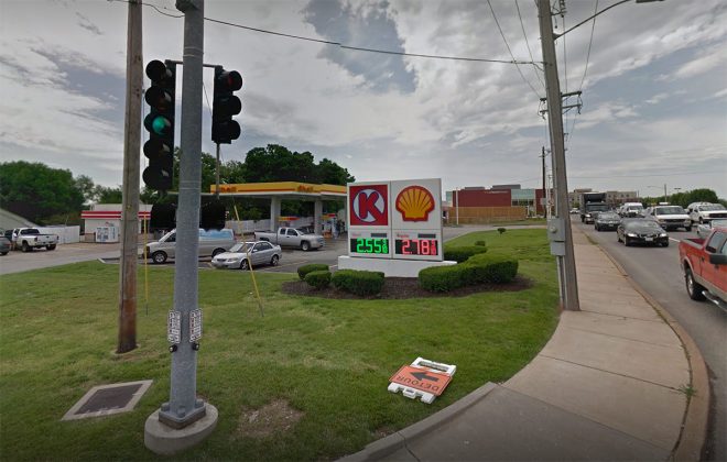
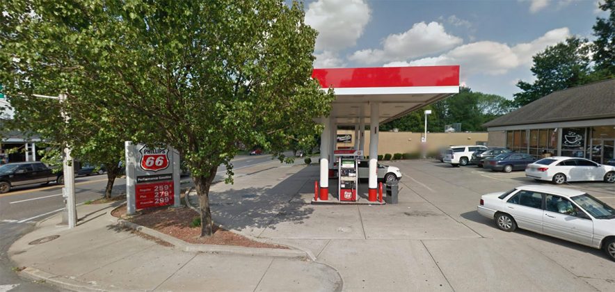
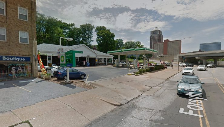
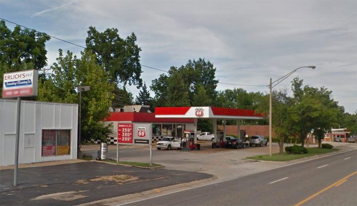
In other communities, gas stations do just fine keeping to the standards Louisville already has in place for places like Floyd Street. Take a look at four examples of gas stations in St. Louis with smaller, less obtrusive signs. There are plenty of examples from all around the country, just not that many good ones in Louisville, where every sign has to be seen by a motorist speeding by at 50 miles per hour.
What’s more troubling is that the Planning & Design staff report finds the appropriate action to bring a noncompliant sign up to code is to issue variances and state that the updated code is an economic hardship on the business of selling cheap gas in an urban neighborhood. That’s a bad precedent to set. Why even bother updating Louisville’s Land Development Codes at all if we’re not going to enforce them or declare them hardships and push bad designs through with a stamp from BOZA?
While a gas station sign might seem small, it’s a sign of a larger problem in Louisville that’s keeping us from building the best city we can for all citizens. It’s a problem that’s only going to get worse unless we confront it head on. BOZA should require this gas station to rebuild its sign in compliance with the Land Development Code rather than issuing waivers and variances that take the teeth out of the city’s codes entirely.


This is Dumb Growth with lots of Kool
aid poured
On top of stupidity. They should be denied this sign on the same basis as anything adjacent to a historic district. Nobody needs to see this from Mars. Having lived nearby for decAdes and borne the plethora of non compliant and ignored flapping flag signs and generally unlandscaped mess this site and its disastrous neighbor across the street with never cited unused sign
Posts and fenced off car wash that died ten years ago…..) thanks for
Alerting us to yet another under the table notice eleventh hour screw job by Vision Louisville.
Regardless of what the code says, what is the particular aesthetic problem with the big columnar sign? I think that the ground-based signs with the little boxwoods around them also look stupid.
Can someone provide evidence that big signs are worse than small signs in some objective sense?
For one thing, it’s about pedestrian scale vs automobile scale. In a walkable neighborhood setting one is appropriate and the other is not. The codes are in place for a reason.
“Appropriate” is entirely subjective. Regarding automobile vs. pedestrian scale – the site in question abuts a major interstate highway, and is a business type that directly serves automobiles. Perhaps it’s appropriate that this site be biased toward “automobile scale”.
“The codes are in place for a reason” – what reason, specifically? Is it anything other than aesthetic preference of architecture and urban planning geeks?
I’m really just playing devil’s advocate here – I like people-scale neighborhoods too, but I’m not convinced that the best means to achieve that end is a set of style rules established by unelected busybodies.
I’d be curious to see a statistic on what percentage of waiver requests are approved by BOZA. I suspect it’s very high.
Useful submit! I really want this sort of article… That is very beneficial for me.