 On Saturday, June 11, the Central Kentucky Chapter of the American Institute of Architects (AIA-CKC) will host its annual Home Tour and this year, we’re excited to be presenting media sponsors. The AIA-CKC Home Tour includes eight houses across Louisville, from Crescent Hill to Old Louisville to Norton Commons—you can view a full list here.
Home Tour tickets for all eight houses and an After Party Downtown at the Marketplace on Fourth cost $15 in advance via Eventbrite and $20 at the door of any house on the tour (cash only). Proceeds will benefit Habitat for Humanity. You can also share the Home Tour with your friends on Facebook. At the After Party Broken Sidewalk will be moderating a panel discussion on residential architecture in Louisville.
Leading up to the Home Tour, we’ll be highlighting each of the architects and their houses in exclusive interviews. Architect and builder Greg Burrus has completed two palatial residences inspired by Louisville’s historic architecture.
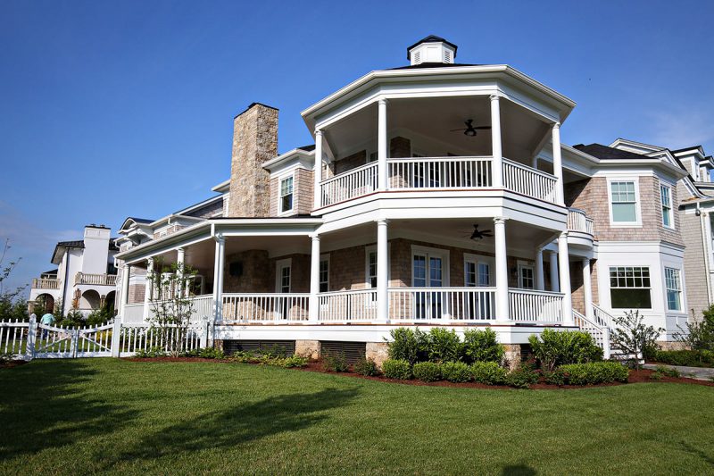
The Hacet Residence and the Yarmuth Residence, 10912 Meeting Street (map) and 8801 Bergamot Drive (map), respectively, in Norton Commons sit prominently on their sites and feature large wrapping porches. The Hacet Residence is designed to feel like a townhouse with a polished interior and high ceilings. Across the street, the shingle-style Yarmuth House features a casual modern feel with a fenced courtyard and double balconies.

Broken Sidewalk: Why should I come tour the Hacet and Yarmuth residences?
Greg Burrus: I think it will be worth the drive out to Norton Commons to see two houses on one stop. The Hacet and Yarmuth Residences are on adjacent street corners so you can park on the side street separating the two. They are both fairly large houses with three levels encompassing roughly 9,000 square feet each that will take a while to tour. And both are customized for their client’s respective tastes and programs.
If people haven’t been to Norton Commons before, or if it’s been awhile since they’ve been there, I think they will enjoy driving around the neighborhood to check out all the recent additions and changes. The project is absolutely exploding with new construction, both commercial and residential.
What were the owner’s priorities for the project?
For the Yarmuth Residence, some of the priorities included (in no particular order) maximizing views of the park, amphitheater, and lake from the rooms in the front of the house. The client wanted to be able to stand in the kitchen and take in the fabulous view. I placed the kitchen, breakfast room, dining room, and living room all at or near the front of the house with nearly unobstructed views from all of these through French doors and oversized windows.
There’s also a large octagonal porch on the corner that makes a great space to entertain with friends and family, particularly on those nights when there is a concert in the amphitheater. The client also wanted a modern, clean design on the interior that is reflected in all decisions related to finishes, color, cabinets, lighting, and details.
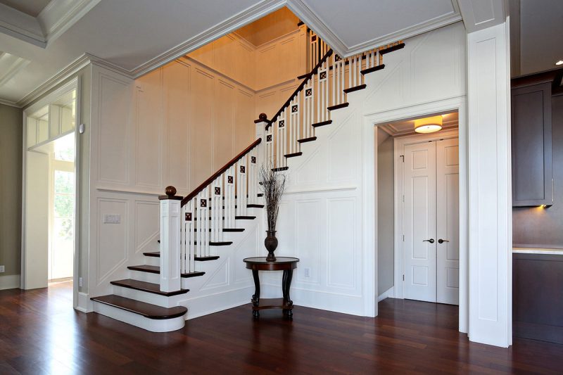
The clients for the Hacet Residence wanted to take advantage of the great views and location also, but perhaps with a little less emphasis on openness. This house has a more formal, sophisticated urban townhouse feel.
The first floor features 12-foot-high ceilings with many interesting ceiling treatments. I designed all of the trim, stair details, and cabinets. The clients placed a great deal of trust in us to present a complete, unified design, inside and out. The quality of finishes is top of the line throughout.
What is the heart of the two homes?
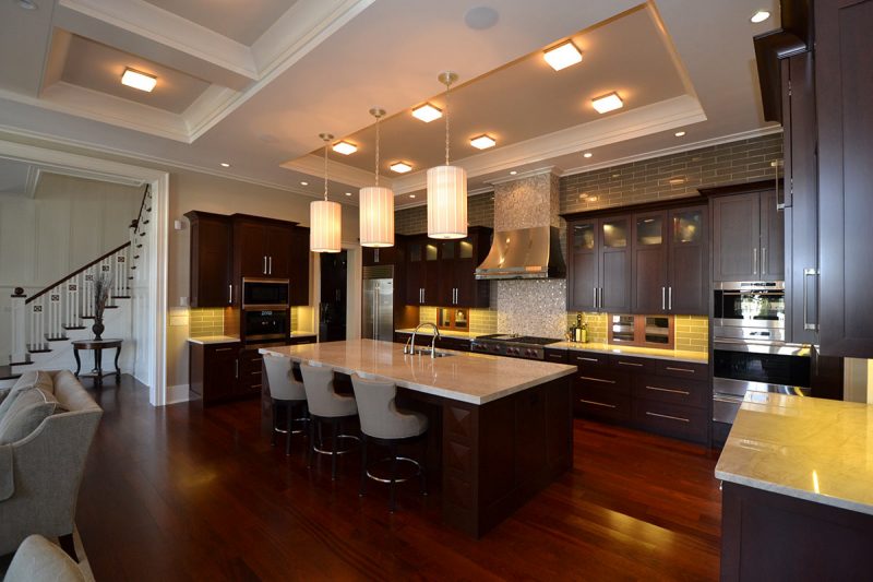
As with most houses these days, I would have to say the heart of both houses is the kitchen. This is where entertaining is focused, as well as day-to-day living. The Hacet Residence kitchen has warm, inviting colors, and a variety of light fixtures to enhance the space. The cabinets are solid cherry with Shaker style one-inch-thick door and drawer panels, with true, full overlay design. The quality of cabinet construction from the manufacturer, Finish Design Woodworking, is unmatched in this region by any other cabinet maker, in my opinion. The doors have brushed nickel bar pulls from Top Knobs. The 5-foot-by-10-foot island features a four-cm-thick Taj Mahal quartzite top. All appliances are Subzero/Wolf.
My wife and I took a trip to Chicago with the clients early in the design phase to have time to talk about the many aspects of the design. We visited the Merchandise Mart and spent a great deal of time discussing the options for the kitchen in particular. I think the results speak to a real collaboration between architect and client, probably in this room more than any other. One of the great results of this collaboration is that we’ve become really good friends and have since done two other commercial projects for the same clients.
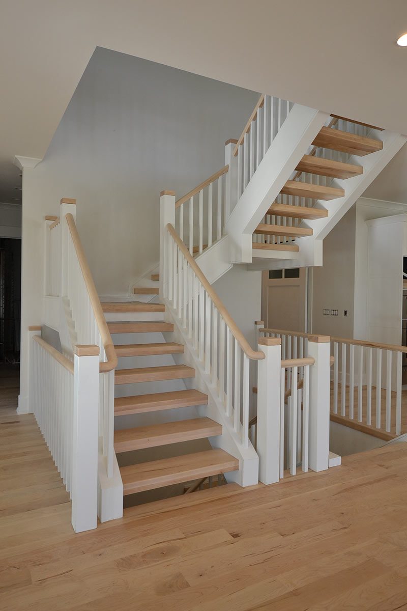
The kitchen in the Yarmuth Residence is also the focus of the first floor of the house. It’s completely open to a small conversation area with a fireplace, the breakfast area, the living room, and the dining room. The free floating staircase is framed out of steel to allow for an unobstructed view between the kitchen and living room. The Shaker style cabinets are soft white with white quartz countertops. The appliances are Subzero/Wolf. The 15-foot-long island is massive, but totally in scale with the size of the combined spaces.
The floors throughout the first floor are natural, rustic maple with clear varnish only, no stain. The living areas and furniture in the Yarmuth Residence are casual, fun, and relaxed. A perfect complement to the owner. This is the third house I’ve designed and built for this same client, and it has been more fun to work with her each time. She truly enjoys the entire process, and that makes the whole experience a joy.
What is the physical context of the houses?
Both clients selected these particular lots because of their proximity to Oval Park across the street and the outdoor amphitheater overlooking a two-acre lake. They are among the most sought after lots in the development because of the views, and yet they are still within a five-minute walk of the town center.
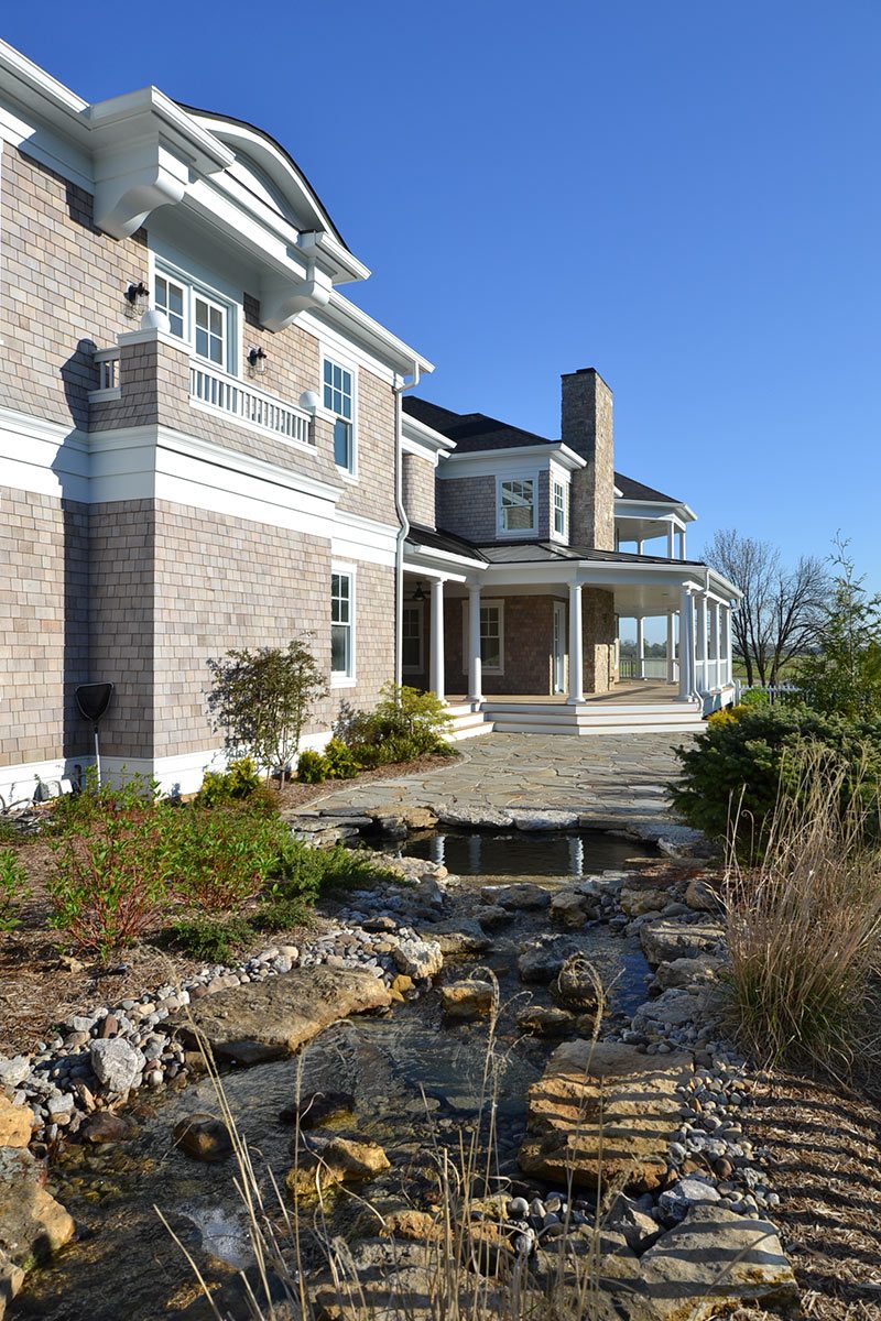
They are both corner lots, and both relatively large for Norton Commons. This allowed for nice size outdoor courtyards. The Yarmuth Residence has a generous covered porch that wraps the entire front and left side of the house, flowing to a natural stone patio and koi pond in the side yard. A painted cedar picket fence encloses the side yard.
The Hacet Residence has a more formal side yard with a square cut travertine terrace, granite topped fire pit in the large conversation area, and a freestanding trellis framing an outdoor kitchen.
What is your favorite moment in each of the houses?
In the Hacet Residence, I think my favorite moment in the house is coming from the foyer into the living room and seeing the full length of the adjoining spaces and the stair open up in front of you. There are so many wonderful details in the main living areas that I never get tired of looking at it from this vantage point. Sometimes if I’m over at the house visiting, or working on something while the clients are out of town, I allow myself to just stand there and enjoy the space. This is truly one of my favorite houses of the hundreds I’ve built over the years.

At the Yarmuth Residence, there are many moments I enjoy, but I think one that stands out is the way the various porches wrap around the exterior, all the way from the front door continuously around the two-story octagonal porch, down the side by the stone fireplace, and then finally terminating in the rear porch with its large sitting and dining areas. From the large rear porch, one can step down three steps onto the curvilinear stone terrace and enjoy the view of the koi pond, lush landscaping, or sit in a nice comfortable chair and watch the flames flicker in the fire pit.

Where do you see the your practice headed?
I see our business proceeding on a consistent track for the next few years as it’s been for the last few. My wife and business partner, Jeanie, and I would like to continue to focus on the sort of high end, custom design/build projects that we’re known for. We are a general contractor as well as an architectural firm. We only design projects that we build. We do occasionally build something designed by another architect, and I’m not opposed to doing that as long as it’s something interesting, and profitable obviously. My preference is to concentrate on new construction versus renovation work. We are very selective on the work we do for a number of reasons. We currently have more commercial work than residential, including a four-story, $7 million, 50,000-square-foot mixed-use project with underground parking garage, and a 5,000-square-foot restaurant, both located in Norton Commons.

I started my company in 1988, and have been involved in residential work from day one. I enjoy the immediacy of doing residential work. Personally, I can’t imagine being in this business without being involved in the construction aspect. I think it would benefit our profession as a whole if more young architects would get involved in construction. Too often it seems we as architects are either too afraid to engage in construction because of perceived liability issues, or because of the potential financial risks involved. Consequently, the construction process is delegated to people with no formal training in design. I just don’t get that. My advice to young people is to jump into construction and learn as much as you can as quick as you can. I thought I knew I a lot about construction when I was younger, but I really knew very little until I got into it as a business. I still learn something new on every project. Life is too short not too get involved in something you love to do.
What trends do you see homeowners leaning toward?
As far as trends in the luxury end of the market, I see clients willing to spend money on energy efficiency, even when it involves extra money up front. Both of the houses on the tour have geothermal heating and cooling, Control 4 home automation systems, Lutron lighting control systems, and LED lighting throughout.
I have seen the sophistication and expectation level of clients rise steadily throughout the course of my career. I think that’s mainly due to the vast amount of information about building, design, and style that is now available 24/7 on the internet, both visual and written. For a while a decade or two ago, I think it was because of the proliferation of TV shows that featured homebuilding and design. But nowadays the go-to source for clients is online. Houzz.com in particular is a great resource for clients to find ideas, and can help them visually express to the architect the types of styles they like. I am continually amazed at the research clients have done sometimes before they even show up for the first meeting.


Glad these homeowners are willing to spend a little extra to mitigate the environmental devastation that results from building 9000 square foot homes on newly developed land!
+1 to everything Camp David said. What the heck does one do with 9000 square feet? Does each family have 10 kids? I can only imagine how little of those places are actually used…