This city is just your type.
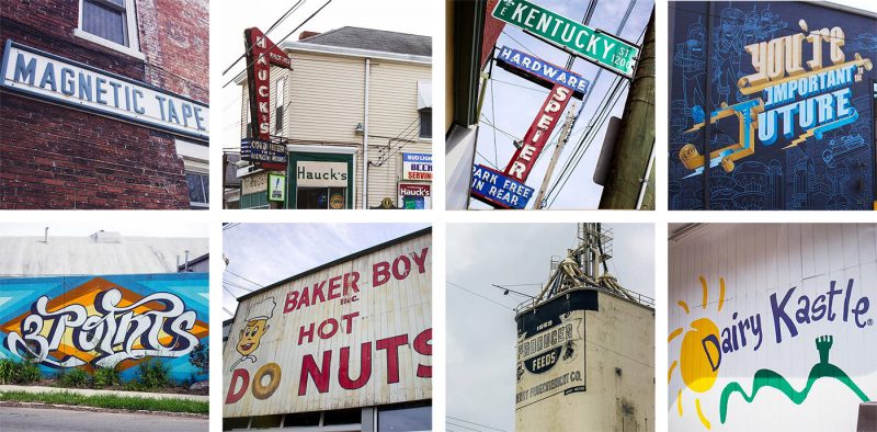
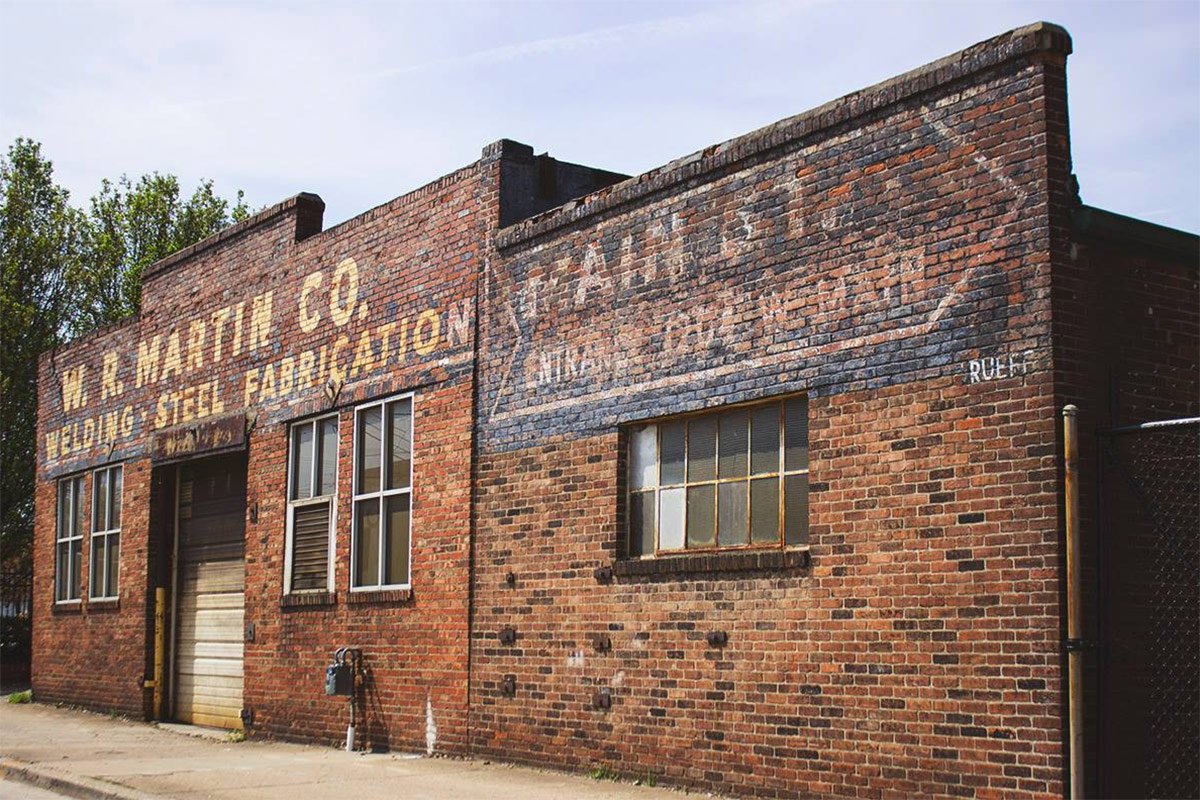
Typography is all around us, hiding in plain sight. The color and precise fonts used for street signs has been studied and tweaked for decades, the whimsical lettering of murals brings an artistic flair to the streetscape, and old signs on even older buildings remind us that the city is a continuum across generations. Some aren’t as pleasant, like jeering advertising or a bad piece of graffiti. But combined, they help show the distinct identity of a place.
This Thursday, April 27, the Louisville chapter of the AIGA presents a talk by designer and author Nikki Villagomez called “How Culture Affects Typography.” She will be discussing type in Louisville and from her travels, contrasting differences between place and identity using her own photographs and other photos taken by Louisville designers.

Villagomez wrote a book on the subject of her talk, titled Culture+Typography: How Culture Affects Typography, where she tackles the varied world of ghost signs, manhole covers, graffiti, hand lettering, and all sorts of signs. (We’ve got a copy in the Broken Sidewalk library.) It’s packed with photos from across the country alongside anecdotes and thoughts from Villagomez. It’s a visual delight for anyone interested in the small details that add so much richness to the urban experience.
Each city, Villagomez points out, celebrates a different aspect of itself. Miami locals love its Art Deco and neon signs while Clevelanders have more machined aluminum lettering, and San Antonians love their city’s old business signage replete with references to the Alamo. She says travelling helps you see a place fresh and new—it awakens the senses—while walking familiar streets might dull our sensitivity to small details over time. “If you can get to a place where you are in that state of awareness in your day to day life, in the city that you live in, you will be more mindful of your surroundings.

The event at the Tim Faulkner Gallery in Portland begins at 7:00p.m. (with an hour of social networking preceding). It’s $5 for students and $10 for professionals. You can get more information on the event’s Facebook page here or purchase tickets here.
You may see Villagomez out walking early on Friday after her presentation. “It is my routine the morning after each talk to wake up stupid early and walk around whatever city I am in,” she wrote in her book. “I explore what each city has to offer and experience the culture first hand. I carry a point-and-shoot camera and my iPhone to document my findings… I just capture what catches my eye.”
For more on typography in cities, check out Villagomez’s blog here and her book. You may also be interested in an interview I did with designer Steven Heller on type increasingly making an appearance at the monumental scale of architecture.


