Because protected bike lanes can make it comfortable for almost anyone in a city to ride a bike to a good transit station, they’re perfect complements to public transit.
And as various cities have found, transit projects that remake streets can be the perfect time to add a protected bike lane, too.
That’s why we’re excited about the new guide for transit-oriented streets that’s due this spring from the National Association of City Transportation Officials. NACTO’s latest design guide draws on examples here in North America to show how streets can fit walking, biking, driving, and efficient mass transit all in harmony.
For example, here’s an annotated illustration of a conventional bike lane that bends out around a bus stop, to avoid any conflict between bikes and buses:

Here’s how it might work with a parking-protected bike lane:

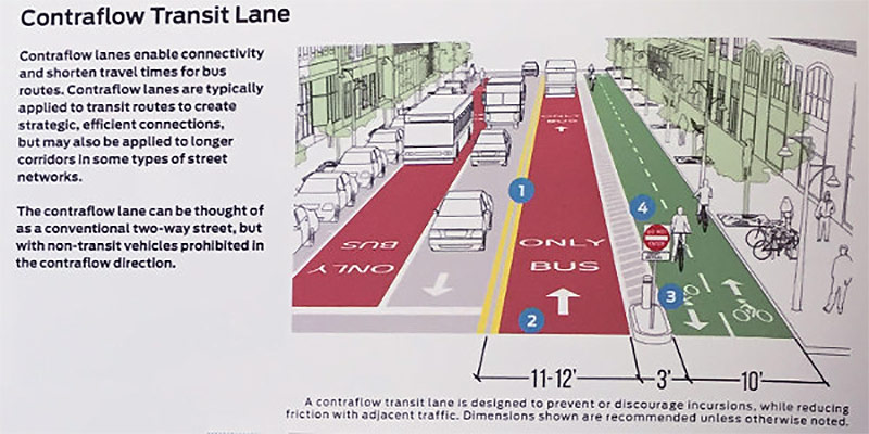
And here’s an illustration showing that a contraflow bus lane on a “one-way” street can also make a pretty good barrier for a bidirectional protected bike lane:

All of this is a huge shift from the way things have been in the United States for years, with buses and bikes both shoved, together, into spaces that cars couldn’t use.
But as many U.S. cities have realized, devoting more and more street space to the least space-efficient way of getting around is just not a very effective way to build a city.
We should be divvying the resources of our cities, including our public road space, among ourselves, not among our machines. Guides like NACTO’s are associated with bikes and transit, but they’re actually instruction manuals for the proper use of cars as tools. NACTO shows us how to make sure that our machines are our servants, not our masters.
[Editor’s Note: This article has been cross-posted from PeopleForBikes’ Green Lane Project Blog. Follow the broader story of bicycling with PeopleForBikes on Facebook and Twitter.]


Yet another post citing nonsense about “protected” bike lanes that make things worse in intersections (where the majority of the motorist-vs-cyclist crashes happen in the first place) AND add the challenge of people compelled to walk across the bike channel to get to the bus stop (adding opportunities for cyclist-pedestrian crashes).
When will this site start showing some intellectual integrity instead of parroting the supposed benefits of such horrendously expensive street furniture without showing the huge downside?
Surprising that they can’t find a competent illustrator who can at least comply with official FHWA requirements for markings. Chevrons, by themselves, indicate a buffer where vehicles (including bicycles) are not allowed to operate.
FHWA staff has repeatedly noted that this use of broken sharrows is expressly prohibited by MUTCD, and that local officials using NACTO publications should be especially cognizant of the need to review their guidance for errors. FHWA started out politely, making indirect references to ” a nationally endorsed compendium of treatments for non-motorized vehicles,” but with NACTO persistently advocating violations of MUTCD standards, FHWA has become much more direct.
“Agencies are reminded to perform due diligence on the Notes in the Urban Bikeway Design Guide and are also reminded that the Urban Bikeway Design Guide does not supersede the MUTCD” has become standard boilerplate from FHWA, along with specific references to where NACTO misrepresents the studies it cites and disregards mandatory standards.
http://mutcd.fhwa.dot.gov/knowledge/faqs/faq_part9.htm#mkgsq7
@Tom Armstrong: Do you have a better proposal for safely accommodating bicycles?
I’m rather intrigued by the “Dutch Junction” as a low(er) cost way to blend bikes, care, and pedestrians at intersections:
http://www.huffingtonpost.com/entry/dutch-junction_us_56a0260be4b0d8cc1098b7b3?cps=gravity_5059_3975953288129988503
Cyclist safety is largely a function of cyclist behavior. When we as cyclists take responsibility for following traffic rules as drivers of vehicles, we have better outcomes. When other road users see us as relevant (as opposed to merely noticing our presence), we get better outcomes.
The one thing all the fancy paint and bollard schemes do is make cyclists and motorists irrelevant to each other until moment of impact–usually at the much more complicated intersections and driveways that result from the fancy paint and bollard schemes.
In other words, it’s a software problem, not a hardware problem. Shiny objects like painted bike lanes and bollards and curbs give the illusion of safer space (okay, I’ll admit it may seem quieter), but do very little to enhance my safety as a cyclist who has a destination.
One reason people give for not cycling is fear. Fear of harassment from other road users is a key component of that picture. Do something to effectively address that harassment (for example, enforce laws already in place against harassment of other road users), and the shared public space we call our streets and roads becomes better for ALL road users.